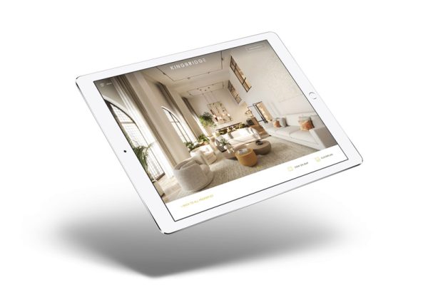
The end of the year is coming up fast, and we are already looking at what web design trends we will see more of in December 2020.
Web Design trends are constantly changing. Some come and stay just for a season, then become completely forgotten. But other trends transform the design landscape for years to come, awakening a new era in the way websites are created.
In the world of web design where evolution is constant. The designers are expected to be willing to adapt to change. In a highly competitive world, understanding the design language is integral to captivating the audience.
Here are the top Web Design trends we expect to see more of in December 2020.
Dark Mode
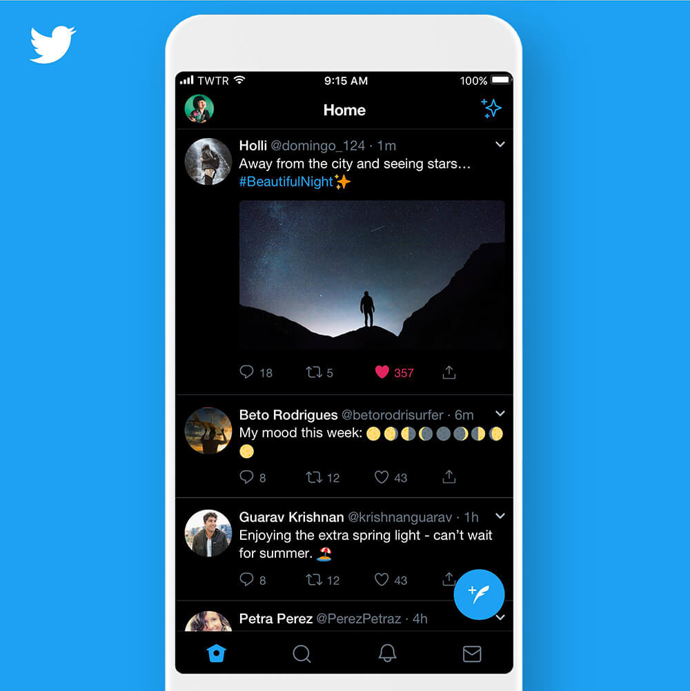
Already a big trend this year, dark mode is set to become ever more popular next year too. Here are some of the main reasons designers love dark mode:
- Makes design elements more visible
- Increases the contrast ratio
- Reduces eye strain in low-light conditions
- It can even save device batter power
Dark mode looks super-modern. Instagram, Twitter, Facebook, and Apple are just a few big brand names that offer alternative themes in their platforms. Also, dark shades allow you to create elements using a neon glow, which is another trend you will find with other dark mode websites.
Bold Fonts
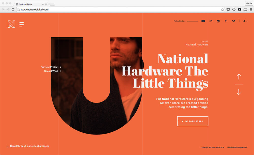
When visiting a lot of leading corporation websites, you will see that bold typography is on-trend. With heavy, bold fonts, the reader is instantly aware of the message, not necessarily the imagery.
However, combining these large fonts with neutral colours further emphasises the headlines, quickly becoming an “image” of their own.
Heavy fonts put more visual weight to the message and direct the reader to where they should look first. Visitors tend to read big headlines first. That is why these play a huge role in making a good impression. From an aesthetic point of view, bold fonts also give designs a modern and contemporary feel.
Unusual Colour Combinations
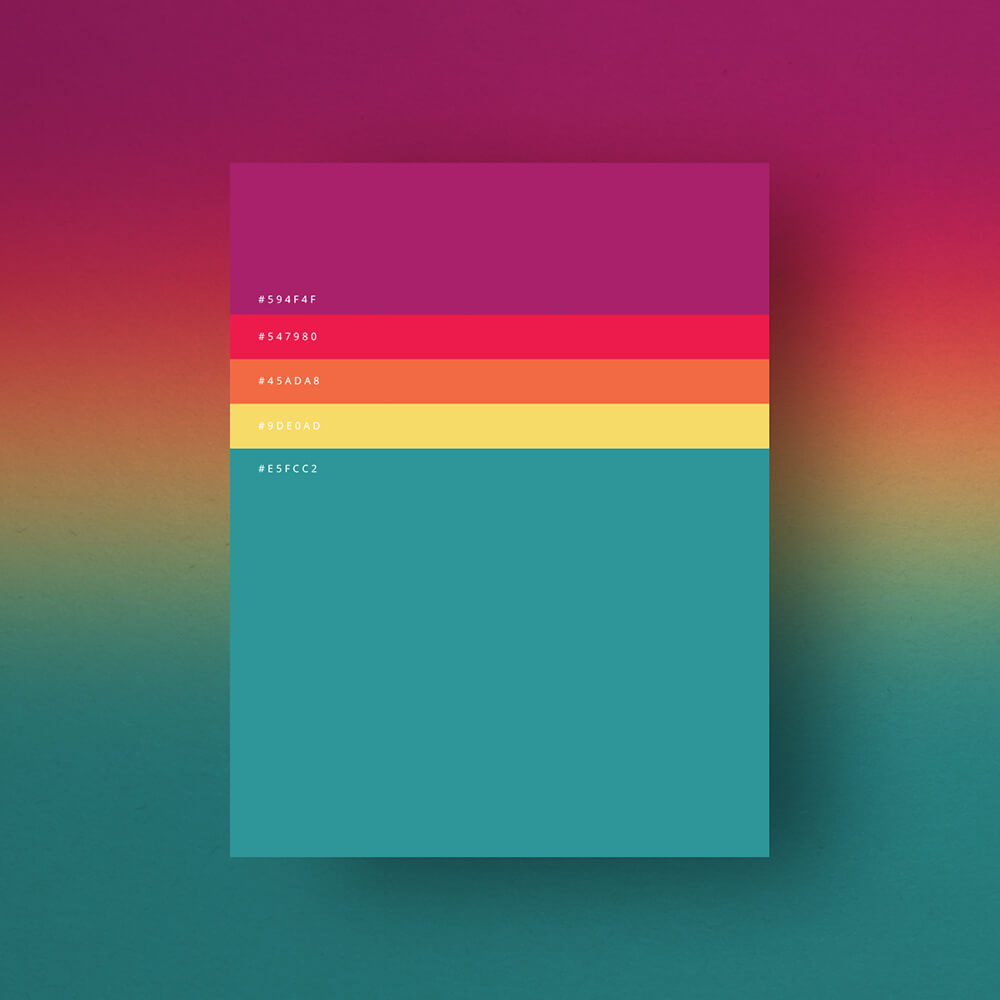
Another design trend this year is unusual colour combinations. Bold, bright, saturated colours help your brand stand out from the soft neutrals and minimalist designs that many companies have chosen over the past few years.
Most prominent web design trends will be the use of bold colours and unusual colour combinations that perfectly harmonise with each other to catch users’ eye.
In 2020, using colour combinations creatively means pairing together colours that your audience wouldn’t normally expect to see combined. Of course, in order to not make your visitors’ eyes hurt, the colour combination should be adapted to the graphics.
To succeed in implementing this trend, you shouldn’t be afraid to try new things. Glowing shades, intense colours, and unusual colour pairings will definitely stick in the memory of your website visitors.
Data Visualisation
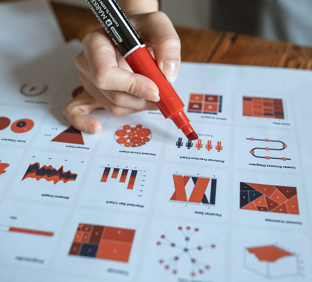
A popular design trend right now is data visualisation. Humans are visual creatures; it is easier to comprehend the information when it is provided visually, rather than in text.
Presenting numbers in a smart way greatly emphasizes the information you are providing. Data visualization shapes boring data into catchy graphics, thus making it much more engaging and easier to understand. It allows users to better comprehend business specific information.
Communicating data in an engaging way is a struggle. But the struggle is worth it. Infographics and graphs are some of the most popular ways to bring data to life.
Gradients
Gradients are a long-time trend that has evolved from subtle colour overlays to eye-catching backgrounds. Gradients can be used to add depth, serve as a striking background, or subtly to add texture to an illustration. We increasingly see it used in bigger and bolder typography.
But compared to the gradients used by designers in previous years, the new generation of gradients has different styling. Now gradients are relatively simple, using a single clear light source and created using one or two colours.
This trend has staying power and we are excited to see the continual evolution of its use on websites.
Abstract Illustrations
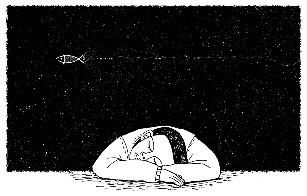
There’s something about illustrations that captures our attention. A brand that uses illustrations on their website is seen as more creative and contemporary.
It is a well-known fact that using a custom illustration style is an excellent way to make a brand stand out. Genuine illustrations are part of a brands DNA. Competitors can copy your colour scheme or typography, but not your illustration style.
With so many illustration styles around, it becomes harder for the users to match a particular style to a specific company. To make illustrations more effective, designers started to embrace more abstract illustration styles. Making abstract illustrations a web design trend of 2020.
Hero Video Headers
For a long time, web designers have had to use static imagery to convey their main idea. But the situation has changed. High-speed connections make it much easier for web designers to turn their home pages into immersive movie-style experiences.
Like a giant billboard, making your homepage hero section full height can focus your users’ attention and serve as distraction free messaging. This is a big web design trend we are seeing now.
Video engages users and they are more willing to spend time watching. Video clips used in a hero section can vary from a few seconds of looped video to full-length preview clips with audio.
Mixing photography with Graphics
Another big trend in web design December 2020 is overlapping graphics onto photography. High quality photographs already look great on their own but adding in some cool graphics will really showcase your creative flair.
Here are some of the top reasons that web designers are mixing graphics and photography:
- It’s a perfect way to add extra personality to your web design.
- Yet another way to reinforce company branding. Think of the colours & shapes used in your logo, for example.
- Adds depth and keeps website visitors engaged with your content.
Designers have also been combining real-life photos with simple illustrations replacing parts of the photo or interacting with the photo.
Micro Interactions
This year we have seen a trend in micro interactions, and they are become even more popular.
On a website, micro interactions are small animations that offer subtle feedback to users. We’re all used to seeing a link change colours when a user moves their cursor over it.
With the focus on micro interactions, that same experience can give more attention to make other elements stand out.
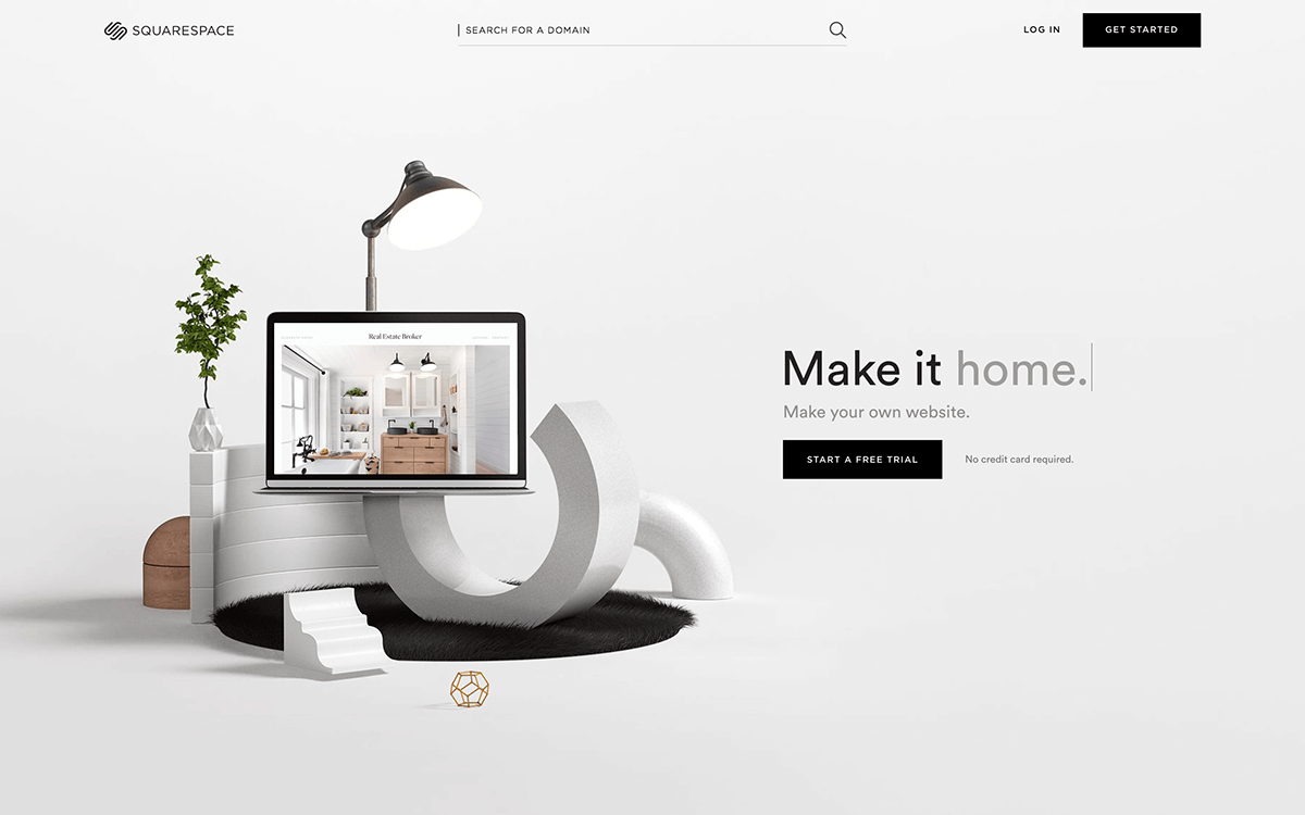
3D Elements
3D design elements have intrigued website users for many years now. One of the most important requirements for a successful 3D graphic is the high performance of your website.
Your platform should be fast-loading and well-optimised. If it’s not, your site won’t be able to support such heavy content. Your website may appear slow and unresponsive, and so on.
If your website is designed well with the 3D elements, then it can really make your web design stand out from your competitors and wow your audience.
Conclusion
At Reactive Graphics we make sure we stay up-to-date on the latest web design trends to keep your website design relevant like the ones mentioned in this blog post.
We recommend that you avoid implementing all the available techniques. It can overwhelm potential customers and make them leave your website. Combine several trends and web design patterns to create a unique solution that will stick out from the crowd.
If you require a website for your business then Reactive Graphics can help your company to correctly position itself in the marketplace.
Get in touch with us today to see how we can get your project off the ground!
Or you can view our portfolio of work here.

