Text is one of the most important visual elements of any website. There exists a multitude of factors that comprise a well-designed website typography style, which can convey not just information to a user, but thoughts and emotions that can influence a user’s experience – a style that fits your brand identity can lead to far more clicks and conversions!
Everybody wants a website that reads well, but this is much easier said than done – with the abundance of text options available in this day and age, designers can find themselves confused as to what typography style will maximise their brand’s potential. Here are some sure-fire tips to make your website typography stand out in 2021.
Use Fonts That Appeal To Your Demographic
Though this sounds straightforward at first, it is a tricky art to master and applies to all fields of brand design. Research your key demographics – what information appeals to them, and what style will help them digest information the best? For websites targeting a younger audience, bold sans-serif headings may be advantageous, whereas a website for an expensive luxury service may find more customers are drawn to pleasant serif and script styles that adds a touch of class to the site.
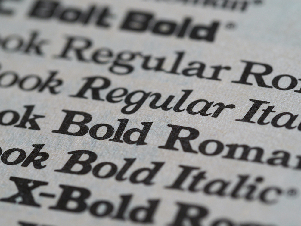
When choosing a font, make sure to take font weight into consideration – some typefaces will read a lot better when made bold, whereas others can look awkward and even illegible. It is best to select 2 to 3 fonts to build your website text around – make sure each has a role and is clearly unique from the others – don’t choose 3 basic san-serifs.

Space Your Words Appropriately
Knowing when your words and letters need to be spaced our more (or less) can help bring out the best in your text sections. Most typefaces are designed to be used as body text and so may need special adjustment when utilised as headers. It is usually beneficial to slightly reduce letter and word spacing on header fonts – this is so less attention is drawn to the whitespace in between the letters.
‘Leading’ refers to the amount of whitespace between lines of text – this is a critical factor to consider when writing longer paragraphs. Adjusting leading to the optimum amount means that users can smoothly follow larger text blocks without having to put effort into digesting the information – poorly-spaced paragraphs can alienate many potential customers.
Go Big Or Go Home
Bigger is generally better when it comes to website text. In an age ruled by mobile devices, it is of crucial importance that your text is not too small to read on any screen size. When designing your site for web browsers, headers should be much noticeably larger than subheadings, which in turn should be noticeably larger than paragraph text.
On mobile, the rule of thumb is to use a body font size of 16px – any less could make your text illegible, and any more could cause awkward line breaks as paragraphs and headings adapt to smaller screens. Short strings of header text will be presented differently on mobile – they should still appear slightly bigger, but will still need to stand out from the body – this can be accomplished by increasing font weight to a bolder typeface.

Website Text Should Contrast Well
Web designers tend to underestimate the importance of good colour contrast – in other words, how your text colour looks up against your chosen background colour. Many tend to lean towards aesthetic website typography choices without considering the functionality first and foremost – does the choice of text colour read well as a first-time viewer of the site, and does it meet accessibility standards? Colour choices that do not meet these criteria will cause any new website to suffer.
Body text generally contains the highest volume of information on a website, and so it is crucial that it is legible for all users. Don’t know how to measure legibility? No problem! The Web Content Accessibility Guidelines (WCAG) are a set of guidelines published by W3C to help developers with a wealth of accessibility issues, including text contrast. To ensure your text content falls in line with the WCAG, choose a text colour and a background colour that provide a contrast radio of at least 4.5:1 – to check your contrast ratio, Lea Verou’s Contrast Ratio Analyser is available for free online.

Find the Right Font Pairings For Your Website Text
As mentioned earlier, 2 or 3 well-contrasting fonts can add heaps of visual appeal to your web design project, as long as they are chosen well. Some fonts will work excellently in tandem, whereas others will look awkward and bland – make sure you do your research and read these tips before deciding on a pairing!
An easy way to choose a good font pairing is to choose fonts from the same ‘font family’ – these are groups of fonts designed to complement each other. Many font families have a range of font types (serif, sans-serif, script) and font weights (bold, regular, light) to experiment with – it may take a while to find the right fit for your project, but it’s worth it!
From a design perspective, choosing a serif font to accompany a sans-serif font is generally a safe bet for well-balanced website typography. It is also recommended to choose fonts with varying weights – bolder fonts are better for grabbing attention, whilst lighter fonts are better for writing out large chunks of information without the screen looking cluttered.
Check Your Line Length
Don’t ever swamp your site with too much text in one place – long, verbose lines of text will bore users and disrupt the flow of your website in general. One of the best ways to make a text more readable is to limit the number of characters used per line.
To strike a good balance between sentence readability and amount of content conveyed, it is a good idea to limit your character count on each line to around 60 characters per line. Lines spanning longer than 80 characters or so can be hard for users to process, as their eyes have to travel further across the screen to process all of the information. Shorter lines can help break up your information for easier visual digestion.
On mobile devices, screens will be narrower and therefore line length should also decrease – around 30 to 40 characters will achieve optimal readability for your user experience.
If you want to build a brand for your business then Reactive Graphics can help.
Get in touch with us today to see how we can get your project off the ground!
To take a look at how Reactive Graphics have transformed clients brand intensities, please take a look at our portfolio of work here.


