Looking to update your web design for the new year, or even planning to kick-start a new website? Look no further than this checklist, detailing the newest web design trends for creatives to be aware of in the new year.
Related Articles:
Bigger, bolder design elements
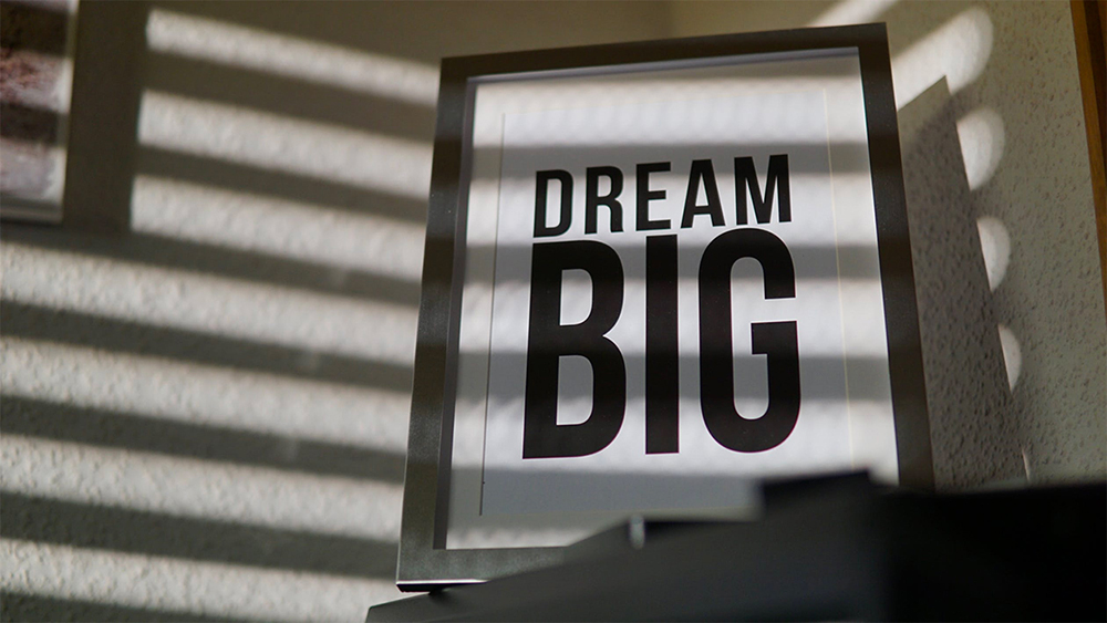
Big typography is bigger and better than ever for the new year!
Designed to catch the eye and make an impact, big, bold typefaces can make a powerful visual statement in web design – especially when they are utilised within a more minimalistic design. Choosing a bigger font size for your headings can help create a striking first impression, and also provides a centerpiece to tie your other design elements together.
In addition to larger fonts, many web designers will find themselves moving away from subtle colour palettes towards brighter, more eye-catching designs. Bold, saturated colours can help your business website stand out amongst the ‘soft neutral’ trends that many companies have implemented over the past few years. Bright colours can be especially effective when they are offset by suitable colour pairings that bring out the best in each other.

Minimalism
In 2022, we expect to see more web designs steer towards minimal design, making generous use of white space which allows website content to breathe. This is referred to by many as “Mindful web design” – it is an approach which argues that people do not wish to be overwhelmed with excessive information or graphics. Mindful web design is benefited further by Google’s recent changes to their search algorithm – a minimal website will have less content to load, and a faster-loading website benefits you in the search engine rankings.
It is worth noting that minimalism, sometimes called “flat design” isn’t a new trend in web design. Historically, it has been associated with black-and-white web design, but do not let this limit your choice of colours! In 2022, we expect plenty of web designers to experiment with colourful minimalism in order to add flair to their designs.
Use of 3D modelling
Although this is not really a new trend, 3D elements look to continue flourishing in 2021. Web designers are keen to embrace three-dimensional design, animation, VR, large-scale videos and high-quality interactive imagery, in order to make their websites more visually appealing.
3D design, which utilises digital modelling software to generate objects with three-dimensional appearance, is also a highly popular trend in graphic design, digital art and typography. It is seen everywhere in web design, from big business websites to smaller, more personal portfolios, and we expect this trend to continue gaining steam into the new year.

Dynamic Scrolling
As is well-known by all Web users, we scroll vertically up and down a page most of the time. On mobile devices, we do the same with our fingers without thinking anything of it! However, advancements in technology are enabling developers to innovate new ways of making scrolling exciting! Two examples of this in particular are horizontal scrolling and gesture control.
Horizontal scrolling explains itself – websites scroll to the side as you move your mouse wheel, which breaks the ever-expected convention of up-and-down scrolling. Scrolling on all planes allows better interaction with the device. The same can happen during website viewing, as you can check the products from any side or angle.
A more advanced form of scrolling, gesture control utilises your webcam so that users can navigate through a website using real-life hand gestures! This type of scrolling is very rare and you would do well to find it on any big company’s website, however with new self-recognition technologies on the horizon, we may see these practices become much more common in the future!
One fast-growing web design trend is “narrative visualisation”. With this, as you scroll and read a long-form article, you get presented with smaller fun web elements which break up the text. This includes elegantly typeset columns, quirky inset images, subtle animations and more.

A blast from the past!
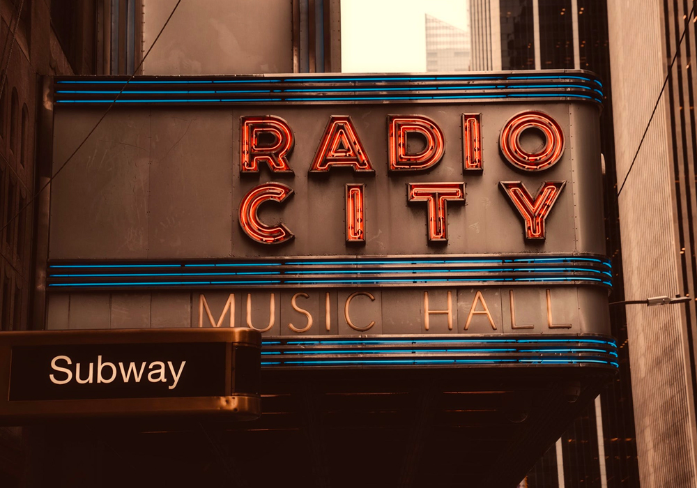
With retro music and clothing currently flying high as prominent cultural trends, we can also see retro UI taking off in the realm of web design. There are an increasing number of businesses, particularly those targeting ‘trendier’ demographics, which are turning to retro fonts (think simple 60s and 70s typography) and design elements to create interesting, nostalgic designs not seen for decades.
There are also a slew of 1990s web design characteristics coming back to the forefront in 2022! As the creation of the World Wide Web becomes more of a distant event from decades gone by, many of today’s web designers are taking inspiration from the early days of the Internet. The web designs of the 90s were characterized by bright colours, bordered table/box layouts and robotic typefaces.
We believe that these elements will be utilised in a more ‘controlled’ manner in the new year – there were a lot of laughably ugly web designs back in the day – but rest assured, today’s designers have brought through the best bits, whilst leaving less appealing characteristics in the past!

MORE accessibility!
Accessibility is by no means a ‘new’ web design trend – in many places, all web designers are required to design their sites in accordance with a list of accessibility standards. This makes sense – in this day and age the web is essential to most people’s daily lives, and therefore action must be taken to ensure it is accessible to everyone.
Some elements that can help you to improve accessibility include:
- Strong contrast between text colour and background colours.
- Adding focus indicators, such as rectangular outlines around links that shows up when using keyboard navigation.
- Using labels and instructions within form fields rather than only giving users low-context placeholder text.
- Always utilising alt tags for images whenever possible.
More websites are integrating theme and font customisations for a variety of reasons, and accessibility is at the top of that list. This includes operating system features such as dark mode (so your website doesn’t cause strain to peoples’ eyes when surfing the web at night), and useful accessibility features like font scaling and contrast adjustment are becoming much more widely implemented across modern websites and apps. With better performance and high accessibility scores, your website will work more efficiently and rank higher in search engine algorithms.
For these reasons, in 2022, we can expect more and more businesses to start paying more attention to accessibility. Incorporating analysis tools for accessibility such as Google Lighthouse and Visual Composer Insights, to comply with Web Content Accessibility Guidelines standards will become a standard benchmark of modern web development.
If you are looking to build or redesign a website, then Reactive Graphics can help. Get in touch with us today to see how we can get your project off the ground!


