It’s no secret that everything is and will continue to be shifted online, especially after the pandemic. This means that it’s harder than ever to make your website stand out from the crowd and keep up with the competition. On top of that, there are so many advancements in technology and design for websites that there are constantly new ways of engaging users which can feel exhausting to keep up with. This blog will go through the top eight website trends that companies will start prioritising and utilising in 2023.
Related Articles:
Parallax Scrolling
Essentially, parallax scrolling is a website effect where the background, which could be an image or text, is moved at a different speed to the foreground of the website whilst the user is scrolling. It works great to make a web page more dynamic especially if your website has a combination of videos, pictures, and lots of text. Parallax scrolling can help organise the information you want to portray on your page whilst making the content more engaging for the user at the same time.
Horizontal Scrolling
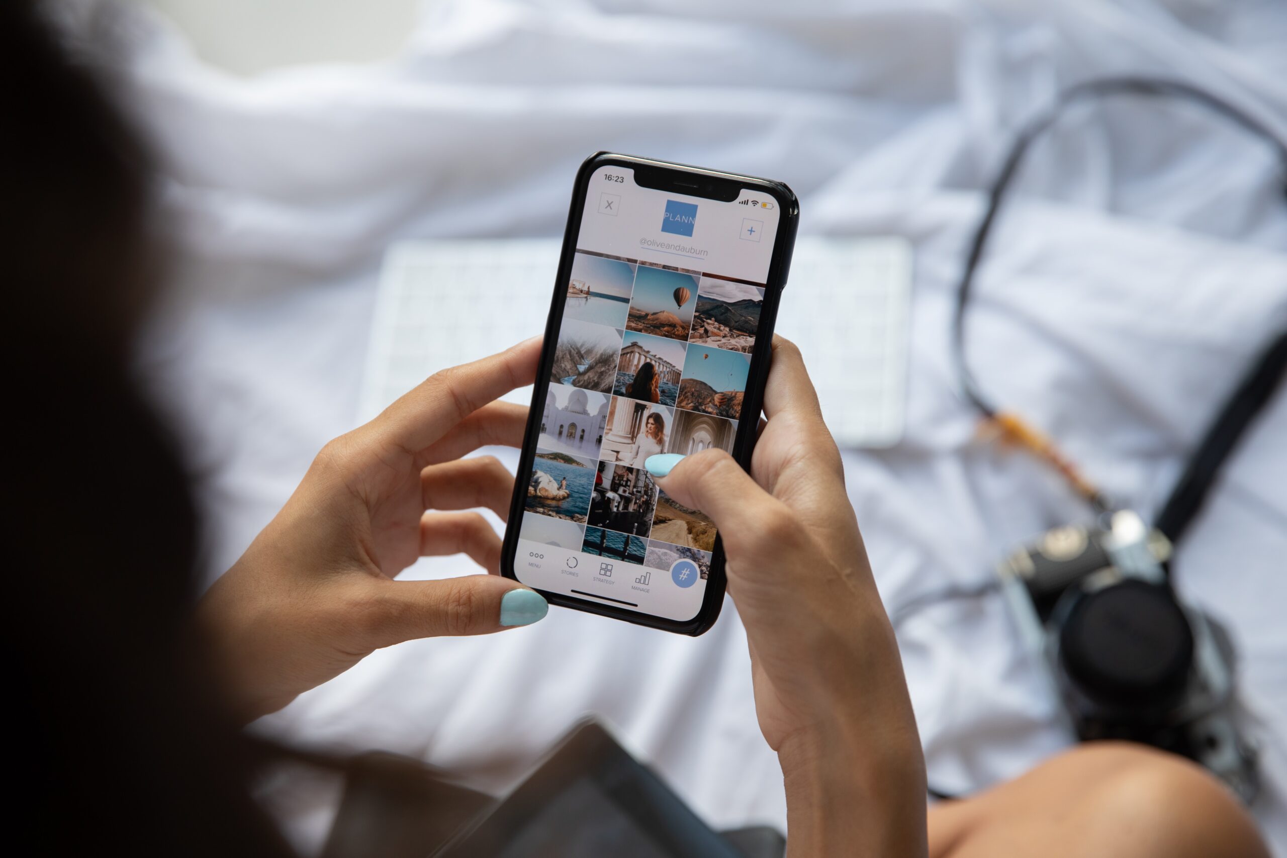
Horizontal scrolling won’t apply to every industry but if you’re in a creative and visual industry like art or fashion, for example, you can use this feature to create an amazing experience for website users, especially for users on mobile devices as an Oberlo study revealed that as of August 2022, a whopping 59.4% of all web traffic came through mobile phones. This website effect is an amazing way to display several images or display information in a large visual area e.g., a map. In recent years, this feature has most popularly been used by photographers or artists to portray their portfolios, you may have also seen big clothing companies use this feature to display new clothing collections.
Chatbots
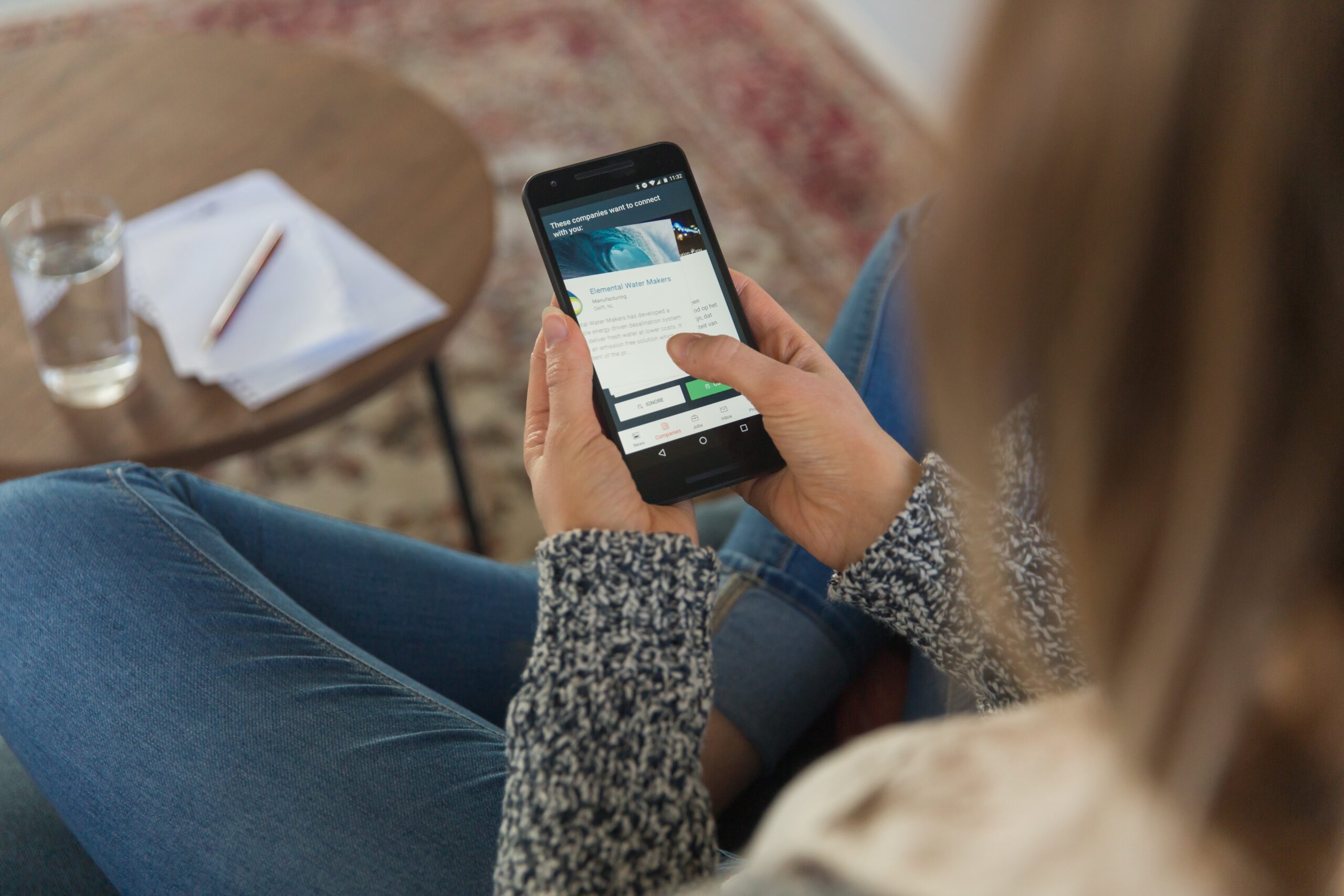
We see chatbots and 24/7 online assistance everywhere these days, and this website feature will continue to be relevant, if not become more relevant in 2023, especially with the continuous advancements in artificial intelligence and machine learning. Although not all consumers will prefer online support as a pose to support from an employee, many businesses are looking to incorporate chatbots to assist with tasks like appointment scheduling, customer support, and even processing refunds or complaints.

Micro-interactions
A micro-interaction is exactly what it sounds like, small animations that users can interact with on a website. They could be as simple as seeing a link change colour when users hover their mouse over it. A more recent example is the use of a bar at the top of an article page, as you scroll downwards towards the end of the article, the bar moves towards the right of the page horizontally until you finish the article or blog. These micro-interactions enhance the experience for the reader by capturing their attention and keeping them engaged without distracting them from the information that you want to portray on your web page.

White Space/ Negative Space
White space is a common technique used by some of the biggest companies in the world. Apple is famously known for using white space in its branding, packaging, and website. It’s a great way of showcasing high-quality images and improving readability in a simple way. This technique just refers to leaving space between elements, the space doesn’t need to be white, it can be any colour, which is why this technique is also referred to as “negative spacing.”
Asymmetrical Layouts
With the high number of websites software out there, a lot of website templates can end up looking quite similar and boring for users. If you’re worried that your website looks too similar to other websites you’ve seen, using an asymmetrical web design will grab the attention of the user by automatically bringing the viewer’s eye to the focal points as our gaze will naturally settle on asymmetrical parts first. You can play around with this website layout by positioning and adjusting different elements on a page so you can direct the user’s eye to different areas. For a truly unique design incorporating asymmetrical layouts, the team at Reactive is here to help.
Dark Mode
Many companies are using dark-mode web designs because it is an eye-catching, practical, and modern way of presenting your website. The great thing about the dark mode is that it can be adapted to almost any type of business, and it reduces eye strain for the reader. It’s an easy and simple way to highlight elements of your web page to create an ultra-modern look.

Unique Use of Colour
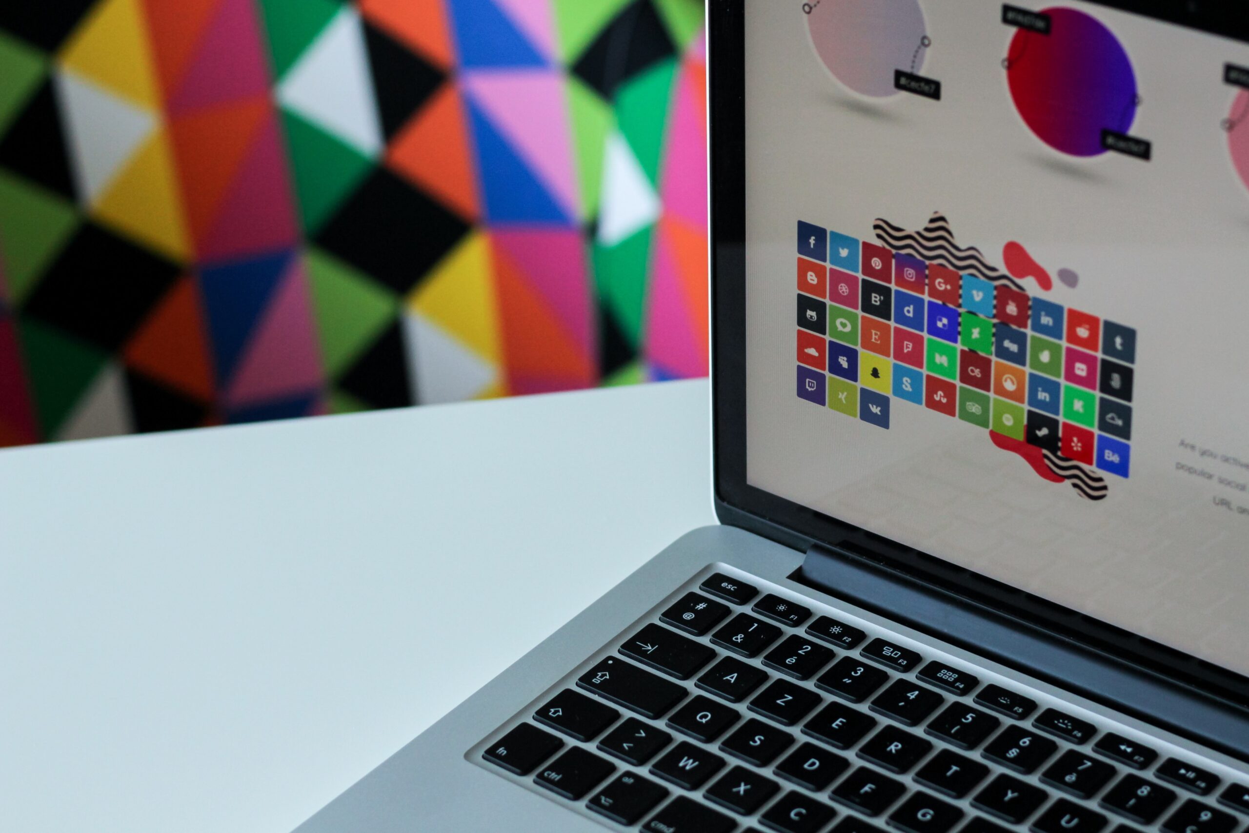
Typically, when picking brand colours most companies may stick to three to four different colours which are then incorporated into their brand identity. However, it has become quite popular to use gradients of these colours to make elements on the web page stand out by adding dimensions and realism to a design. Spotify is known for doing this, they usually use gradients of the colour purple or green on their websites and it provides an eye-catching and unique feel to their website and app. Utilising colour gradients is very visually appealing and a great way to add sophistication to your website whilst also looking modern.

Bonus Section
No matter how beautiful and elaborate your website design may be, user experience is more important. One of the main factors that contribute to great user experience is fast website speed as it helps to streamline the browsing experience and process for the website user. Ideally, you should aim for your website to load within two to three seconds as a study completed by Website Builder Expert revealed that 40% of consumers will wait no more than three seconds before leaving a site. Improving your website speed doesn’t have to be complicated or expensive, there are some easy ways to improve your website speed such as cleaning up your website’s code by removing unnecessary elements like white spaces or inline spacing, compressing and optimising images on your website, or minifying and combining files, a good place to start is normally HTML, CSS, and JavaScript files.
Using some of these techniques and incorporating great accessibility and website speed will ensure you have the perfect website for your business. If you want to keep up with more updates like this, be sure to follow us on social media and have a look at our other blog posts linked below.However, there are many more issues not covered here that need to be considered. If you would like professional assistance for a smoother, less stressful web design process, Reactive Graphics are here to help. Get in touch with us today to find out more.
