Have you ever seen a website that was so messy you didn’t know where to look?
If you are having trouble focusing on what is important, it might be because the layout doesn’t have a clear visual hierarchy.
To create a successful website, you need to understand how people’s brains read and process information. In this article, we will look at what visual hierarchy in web design is, why it is important and the main principles that guide it.
Related Articles:
What is visual hierarchy?
Visual hierarchy is a way to arrange design elements by their importance to guide user’s attention. A clear visual hierarchy helps direct the eye to the most important parts of the page. A good way to see visual hierarchy in action is through poster design. Posters are often large and placed in busy spots where you only have a few seconds to catch people’s eyes. To do this, they are designed so that the most important information really stands out.
Why is visual hierarchy important in web design?
Visual hierarchy is key to making your website engaging and easy to use. Without it, if every part of your design were treated equally, nothing would stand out. Visual hierarchy highlights the most important elements, helping to guide user’s attention and keep them interested. It also helps people find what they need and do things like fill out forms or make purchases. By making sure important content stands out, it helps visitors navigate your site smoothly. Overall, a good visual hierarchy makes your website more intuitive and user-friendly.
Principles of visual hierarchy in web design
Understanding visual hierarchy in web design is key to creating an effective UI and UX experience. Let’s go over some principles you should consider when designing a website.
Scale
The principle of scale means that bigger elements catch the eye more easily, so using size helps show what is most important. To make scale work effectively in your design, use just three sizes – small, medium and large. This helps keep things clear and organised, like having different sizes for headers, subheaders and body text. Make sure the most important element is the largest to grab attention and keep less important elements smaller. Don’t use too many large elements, ideally just one or two to ensure they stand out and make the hierarchy easy to follow.
Colour
Colour isn’t just for making your site look nice. It’s a powerful way to create a visual hierarchy. Bright colours like red or orange catch the eye, while softer colours like green or blue tend to fade into the background. By using colour wisely, you can highlight important areas of your site, like CTAs or key messages. Just be careful not to overdo it. Stick to a consistent colour scheme that fits your brand identity and use pops of colour sparingly to draw attention where it is needed most.
Contrast
Contrast is important for creating a visual hierarchy in a web design. Contrast helps make certain parts of your design stand out. You can use things like colour, brightness or font-weight to do this. A bright headline on a soft background catches the eye quickly and a dark button on a light page is more likely to get clicked. Good contrast helps people spot important information easily.
Scanning patterns
When people browse the web, they usually don’t read every word. Instead, they scan the page to find the important parts, using different reading patterns. There are two main reading layouts the Z pattern and the F pattern.
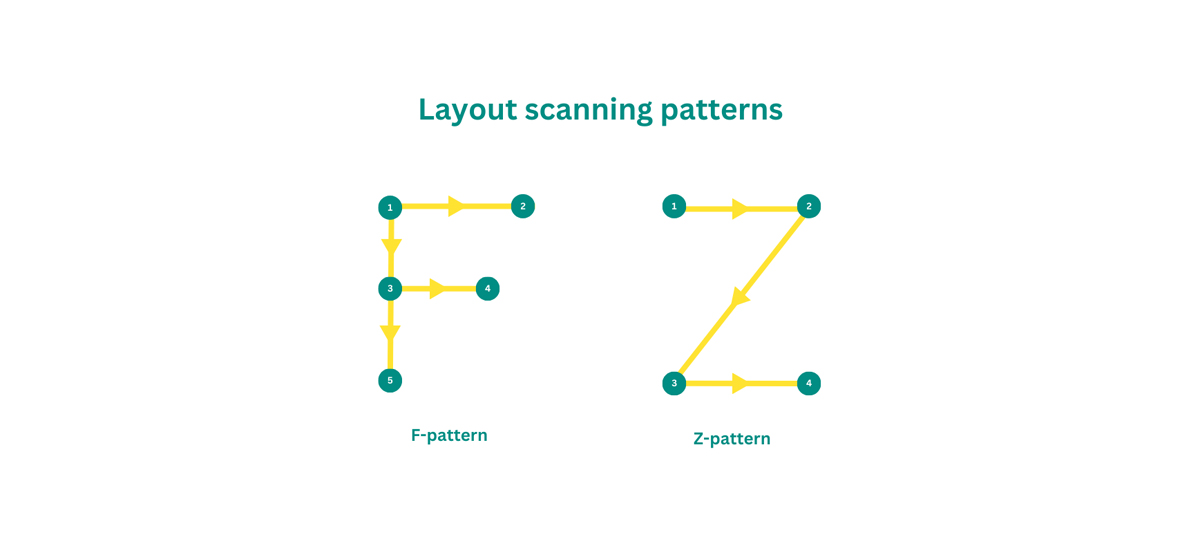
The Z-pattern layout draws attention from the top-left corner first, moves to the top-right, then down to the bottom-left and finishes at the bottom-right. Each corner typically features something important, like a logo or a call-to-action button. On the other hand the F-pattern layout, which leads visitors from left to right and then back again is ideal for text-heavy pages.
Proximity
This principle says that elements placed close to each other on a website look more related than those that are further apart. Proximity has a strong effect on visual hierarchy in web design, to the point that it can even override other factors such as similarity in colour or shape.
Density and whitespace
Fitting too many elements into a space can make it feel crowded and messy. If elements are spaced too far apart, it can be hard to see how they are connected. The key is to balance things so that it is easy to tell which elements go together and which don’t. Use whitespace around important information or buttons to reduce clutter. This not only makes your site look better but also helps focus attention on key parts by setting them apart from the rest of the content.
Texture and style
Choosing the right textures and styles helps make your web design clear and appealing. Textures, whether subtle or bold, can make elements stand out and help separate different sections. Common options like gradients, shadows and patterns can make your website more eye-catching. But be careful, too many textures and styles can make the design look cluttered. Keep things balanced to maintain a clean and attractive look.

Consistency
People are often overwhelmed by information and naturally prefer simplicity, sometimes without even realising it. To ease their mental load, users look for shortcuts, patterns and straightforward ways to interact with digital tools and communication channels. Consistency is crucial for achieving this simplicity. It helps show how elements connect and creates a clear visual structure. This involves using the same icons, fonts, image sizes, buttons, labels and other key elements. By placing items consistently on the page, you help make a website easy to scan and well-organised.
Grid-based layouts
Grids help organise your page, making it easier for users to understand the layout and find what they need. Using grids for alignment and spacing helps create a visual structure, adding rhythm and flow that makes the content easier to understand.
Typography
Typography hierarchy makes text easier to read by arranging it to show which parts are most important. Without it, every letter, word and sentence would look the same, making the text harder to understand. In general every design should have three levels of hierarchy: a heading, a subheading and body text. After that, it is up to the designer to decide if any additional levels are needed.
How to test the hierarchy of your website
To test your hierarchy, do a user test. Ask someone who doesn’t know your website to visit the page and tell you which parts they notice first, second, third and so on. It is a good idea to test with several people to get more feedback. Their comments will show you which parts are too noticeable and which need more attention. Then you can adjust your page based on the hierarchy principles mentioned earlier.
Also we recommend checking out tools like Inspectlet, Microsoft Clarity and Hotjar. They offer features like session recordings that show how users interact with your site – where they click, how they move their mouse and more. They also provide heatmaps to help you see which parts of the page attract the most attention and which are overlooked. This insight can be really helpful for tweaking your site and making it more user-friendly.
Visual hierarchy is important in web design, but you need to understand your content and what you want to say before picking your visual hierarchy and style. Sometimes you can use different methods for visual hierarchy, but other times you might have to work with limited space or specific background colours.
The best approach is to choose the visual hierarchy techniques that work for your situation and use them to make the content clear and easy to read. The goal is to organise the information so users can understand it easily. A skilled UI designer can help you ensure your content is organised effectively so users can understand it easily.