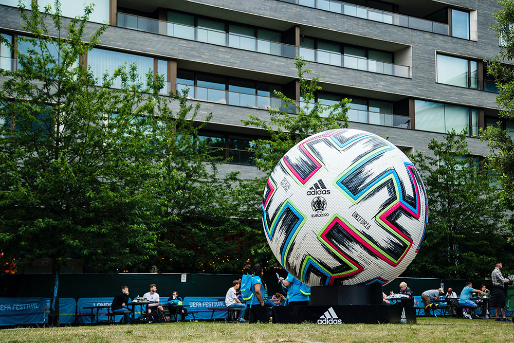
The 2020 UEFA European Championship takes the stage this summer as Europe’s premier international football competition, a year after the COVID-19 pandemic resulted in the Euros’ postponement.
Football is highly interesting from a design perspective – the Euros only takes place every four years, which means big changes in cultures and trends can occur in between tournaments.
As fans from all over the continent flock to Euro 2020s host cities – London, Amsterdam and Rome to name just a few – it is always fun to take a look back at Euros history and how its logos and brand designs have changed since the inaugural tournament took place in 1960.
1960-1992
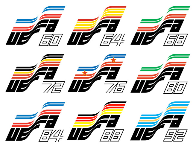
For the first nine Euros tournaments, the logo was kept consistent in design. The UEFA logo is laid out under five coloured stripes, which distort to take the shape of a waving flag.
It is a fairly simple design, but highly effective at communicating the key elements of the tournament – its governing body, and the time and location it takes place at. Its use of bold, blocky text brings a retro feel to the logo, a style that has grown in popularity over the past decade.
The classic logo will appeal to the nostalgia of those who grew up watching football during this time period, as well as a younger demographic who have taken an interest in the vintage styles from decades gone by.
1996
England fans will remember this one fondly – Gazza’s goal versus Scotland, beating Spain on penalties at Wembley, “Three Lions” in the charts, and inevitable exit at the hands of the Germans.
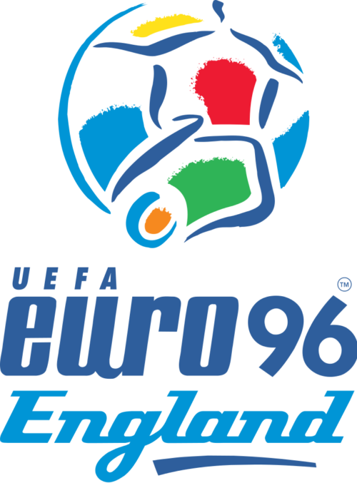
The 1996 logo is a strange one, for sure. Moving away from the geometric, rigid shapes that emblazoned the logo from 1968-92, the football-shaped crest takes inspiration from hand-painted artwork.
Brush stroke effects are maximised to create a flurry of movement within the logo, and four starkly differing fonts make up the typeface. It conveys the vibrant chaos that can ensue at a fast-paced sporting spectacle, but still keeps it classy.
2000
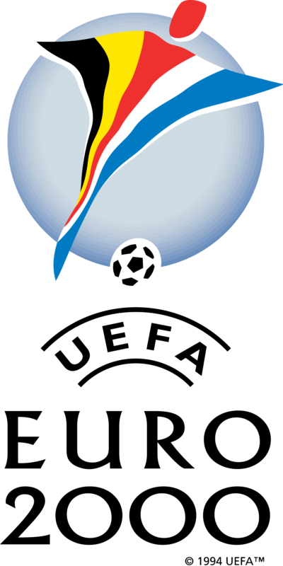
Belgium and Netherlands were the joint hosts of Euro 2000, and that is the focal point of the crest – both countries’ colours blended together into the distorted shape of a footballer. A simple black serif typeface replaces the mish-mash of fonts used for the previous tournament, heralding the end of the colourful 90s era.
In the writer’s opinion, this is the weakest logo of the lot – the crest comes across as confusing and doesn’t seem to convey a lot of information to viewers. French fans won’t care though, as they took home the trophy after defeating Italy 2-1 in the final.
2004
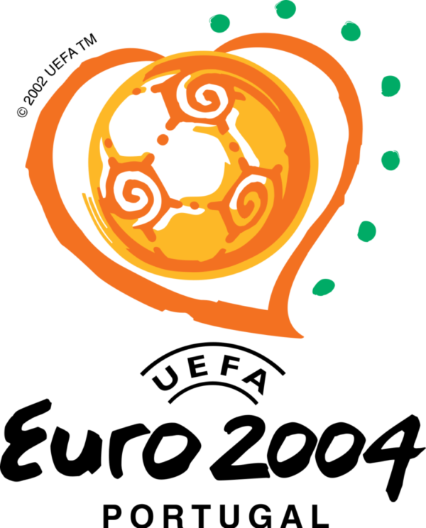
We were off to sunny Portugal for 2004’s tournament, and its logo does a great job at conveying the climate, with bright tropical oranges and greens putting fans in the mood for a summer bonanza. On the crest, a brush-stroke heart around a beautiful spiral-like football encapsulated millions of peoples’ love for the beautiful game.
The informal strokes on the ‘Euro 2004’ text bring a down-to-earth comfort to the typeface, and when coupled with the sans-serif subtitle there is a really effective contrast to round off an excellent logo.
Euro 2004 provided one of the biggest footballing shocks of the 21st century, as 23rd-ranked minnows Greece defeated hosts Portugal in the final to lift the trophy.
2008
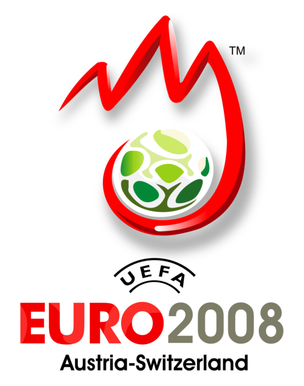
Two Alpine nations, Austria and Switzerland, joined up to host 2008’s Euros – so it seemed a no-brainer to incorporate the mountainous terrains into its logo! Red and white is used primarily to represent the hosts’ colours and a green football nestles itself amongst the mountains as a nod to the Alps’ beautiful natural vegetation.
The white glimmer on the red mountain lines is a classic example of the ‘shiny’ design trend present throughout much of the 2000s. A sans-serif font is used consistently as the typeface with varying weight, which sets an early precedent of ‘flat design’ for the Euros logos going into the 2010s.
Spain were the eventual victors in the Alps, kicking off a four-year dynasty that saw them win the 2008 Euros, 2010 World Cup and 2012 Euros consecutively.
2012
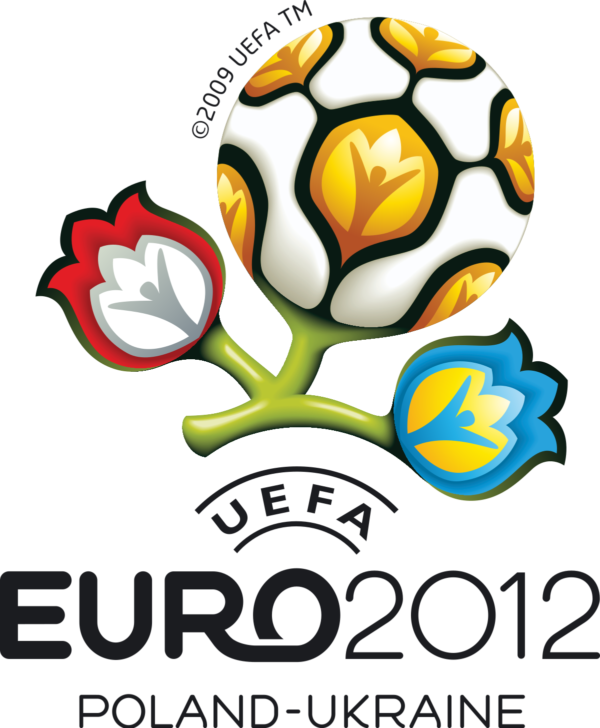
2012’s logo delves further into symbolism, with two blooming flowers representing joint hosts Poland and Ukraine and a large flower-like football taking centre stage.
The floral artwork is inspired by ‘wycinanka’, a traditional form of paper-cutting popular in Eastern Europe, and the human-shaped stigmas within each flower conveys a feeling of community and togetherness for football fans around the world.
UEFA appear to have finally settled on a consistent typeface for their logos going forward, with the rounded sans-serif font used here featuring in every logo up until the time of writing. It is certainly easy on the eyes, with the linking ‘R’ and ‘O’ providing a nice bit of flair.
2016
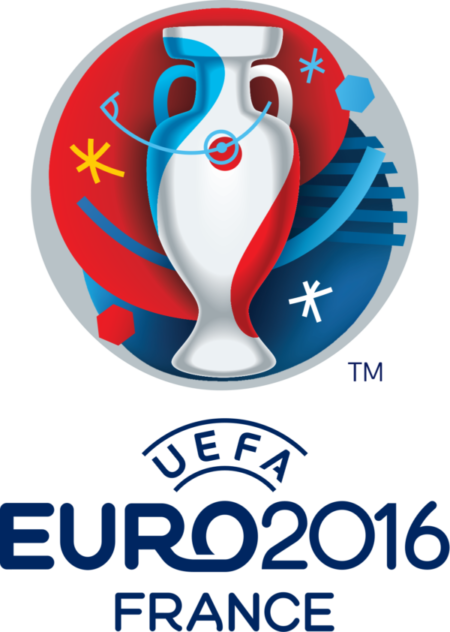
A more straightforward approach was taken in designing the logo for France’s tournament in 2016. For the first time in history, the Euros trophy itself is used for the crest, with the French colours overlapping it to create a cool modern effect.
Simple lines and shapes are scattered around to give this logo a fun ‘party’ atmosphere synonymous with the nature of the tournament. However, there isn’t much more to this logo – it seems a bit more generic than those gone by, with less symbolism and meaning behind it.
Despite France hosting this year’s tournament, they lost out on the trophy to Portugal, who held on in extra time to win the final 1-0.
2020
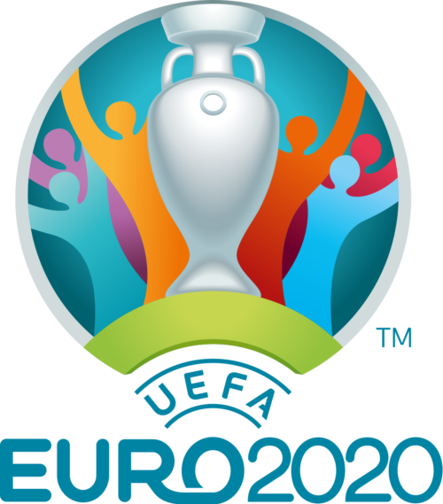
The first ever Euros to take place across the whole of Europe embraces community as a key facet of its logo. Following up on the previous tournament with a very similar design, the gleaming trophy surrounded by cheering spectators symbolises a celebration of the beautiful game as the tournament moves across Europe’s finest footballing cities.
The logo is more stripped back than its predecessor, with only big shapes making up the crest and no smaller strokes or emblems. This simpler approach works well for this year’s tournament, and we can expect many more great moments from the event as we approach the finals at Wembley.
If you want to build a brand for your business then Reactive Graphics can help.
Get in touch with us today to see how we can get your project off the ground!
To take a look at how Reactive Graphics have transformed clients brand intensities, please take a look at our portfolio of work here.
