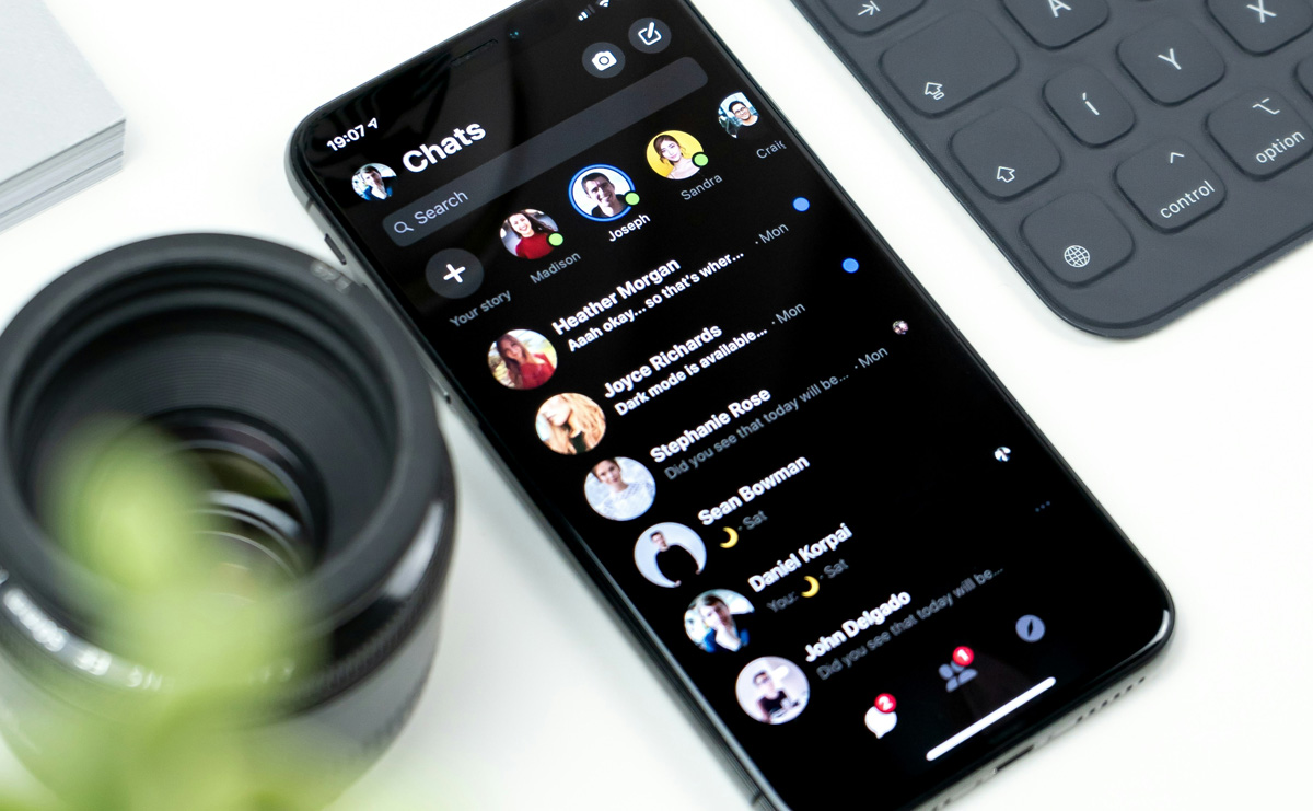
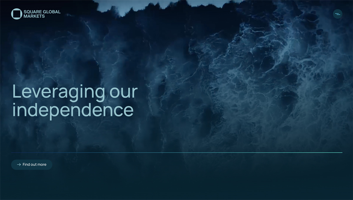
Dark mode web design has become a popular trend and it is clear that businesses and web designers should pay attention to it.
Many users prefer dark mode on their devices. About 82% of smartphone users have it turned on and nearly 83% of desktop users like using it on their computers. Plus, around 34% of users like using dark mode when checking their emails.
If you run a business, think about adding dark mode to your websites and apps. This feature can enhance the user experience (UX) and attract more customers, making your website more appealing and easier to use. Offering dark mode shows that you value your user‘s preferences and comfort, which can help build loyalty and keep people coming back.
Related Articles:
What is a dark mode web design?
Most websites and apps usually have dark text on a light or white background. We are all used to seeing this when we browse the internet or use our phones. Even before computers, we wrote with black ink on white paper and read books with dark text on light pages. It is just how things have always been for us.
But dark mode changes all that by switching from light backgrounds to dark ones. Instead of dark text on a white background, dark mode features light text on a dark background. It is hard to pinpoint when exactly dark mode was introduced, but in the past years, it has become an increasingly popular feature in major platforms like Facebook, Google, YouTube, Microsoft, X and Instagram.

Advantages of using dark mode on your website
Reduce eye strain
One of the best things about dark mode for your website users is its potential to reduce eye strain. If they stare at a bright screen for too long, it can tire out their eyes and even give them headaches. Dark mode web design cuts down on blue light, which is especially helpful in the evening before bed because blue light can mess with your sleep. Also if they’re in a dark room, a darker background is much easier on the eyes. This is especially true for apps and websites where people spend a lot of time reading or scrolling, like social media or news sites.
Looks appealing
Let’s be honest dark mode looks fantastic. While most websites stick to a bland white design, dark mode stands out with its mysterious and fresh feel. Colours pop against dark backgrounds, making them more vibrant for your website users. It also creates great opportunities for showcasing graphic content like graphs, dashboards, images and photos. Dark mode gives websites a stylish, modern look, so it is a smart choice for brands wanting to keep their design up-to-date for their users.
Saves user’s battery
Dark mode web design can help save battery life for your website users, especially those with devices that have OLED or AMOLED screens. In these types of screens, each pixel creates its own light. When dark mode is used, pixels displaying black are turned off entirely, which conserves energy. So, if your website offers a dark mode option, users with OLED devices may experience longer battery life compared to using a regular light mode.
Readability
Dark mode can help your website visitors read more easily, especially those with certain vision problems or who are sensitive to bright lights. The dark background and light text can make the words pop and be clearer. Still, how easy it is for users to read can vary based on personal preferences and how well the dark mode is set up on your website.

Disadvantages of using dark mode on your website
Some people see dark colour as something negative
Think about a person in dark clothing – do they seem elegant and mysterious or do they look sad and gloomy? Beauty is in the eye of the beholder and the same goes for dark mode. For some website visitors, dark colours can bring up negative feelings and sadness, while others may find them elegant and luxurious. Although we love dark mode web design, it ultimately comes down to what each person prefers.
Readability
When creating a website with dark mode, you should be aware that light text on dark backgrounds can be hard to read if the contrast is too strong. This can create a “halation effect,” making the text look a bit blurry, which may be especially challenging for website users with astigmatism.
Dark mode website development time
Another downside of adding dark mode to your website is that it can take a lot of time to develop and test, especially if your site is large. This work can be time-consuming and may need extra changes to make sure everything looks good in dark mode. Because of this, website owners will need web development support to handle this process effectively.
Battery life
If your website users have phones or computers with older LCD screens, dark mode won’t really save their battery. They will need a OLED (organic light-emitting diode) screen for this to be the case.
You can find different and sometimes debated opinions about dark mode. But at the end of the day, it all comes down to personal preference.

When to use a dark mode on your website
While dark mode web design can be useful in some situations, it is not always needed. Here are a few examples of when it is a good idea to use dark mode on your website.
Long sessions
The more time people spend looking at your design in one sitting, the more likely they are to experience eye strain and drain their device’s battery. Adding features like dark mode on your website can make a big difference, helping to keep their eyes more comfortable and extending battery life. For example, this is especially helpful for users reading an e-book on your site.
Frequent usage
The more users interact with your design, the longer they will spend looking at it, which means they are more likely to use it in low-light settings. For example, messaging apps like WhatsApp or Messenger are often used at night, so having a dark mode can help make it easier on the eyes.
Low-light situations
Using apps in a dim environment, like a navigation app at night, can make bright white screens really annoying for users. When your eyes are used to the dark, bright screens can feel harsh. That sudden burst of light makes it tough to focus and can tire your eyes out quickly.
Minimal use of media
When there is little use of media like photos and videos generally look the same in light and dark modes. This means that if you have a lot of this type of content, dark mode doesn’t make much of a difference.
Minimalist content
Dark mode works well for minimalist content by making important parts stand out clearly against the dark background. It keeps the design simple and clean, helping users focus on what matters most.

Dark mode website: Tips and tricks
- Using pure black with white text can create too much contrast, which may lead to eye strain for users. Instead of using pure black consider using a softer shade. For example, Google’s design team recommends using “Cod Gray” or colour #121212. Also consider inviting a UI designer to help choose the right colour schemes, contrast and shades for your design.
- Instead of using pure white, try a softer shade. Using a softer shade for the text on a dark background can make it easier on the eyes and still easy to read. This combination helps make reading more comfortable.
- Instead of using black or grey colour, try using a much darker shade of your primary brand colour for the background. For example, if your brand colour is blue, you could use a dark navy or midnight blue.
- A great tip for adding dark mode to your website is to include a toggle that lets users easily switch between light and dark modes. This gives users the choice to pick what works best for them based on where they are and what they like. Make sure to place the toggle in an easy-to-find spot, like the header or footer, so that everyone can quickly find it and use it.
- Avoid using shadows in dark mode. Shadows are often used to show depth and help people see the difference between the background and the content in light mode. While this works well in light settings, it can be confusing in dark mode.
- Don’t forget to adjust your images for dark mode as well. Make sure they blend well with the dark background by using a filter to tweak their contrast and brightness.
- Before you finish your dark mode UI design, check how it looks in different lighting conditions, both dim and bright. It’s also a good idea to test it under regular light bulbs.
In conclusion, dark mode websites work well for minimalist content, social media, and entertainment platforms. Choosing dark mode or light mode depends on the kind of site you have and the experience you want to create for users. Some of the best design agency websites take this into account when planning layouts. What do you think: does dark mode help you focus better when browsing or do you prefer the classic light mode?


