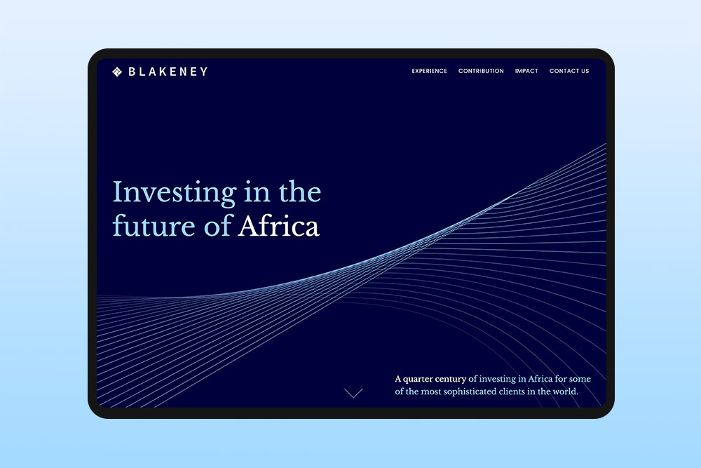
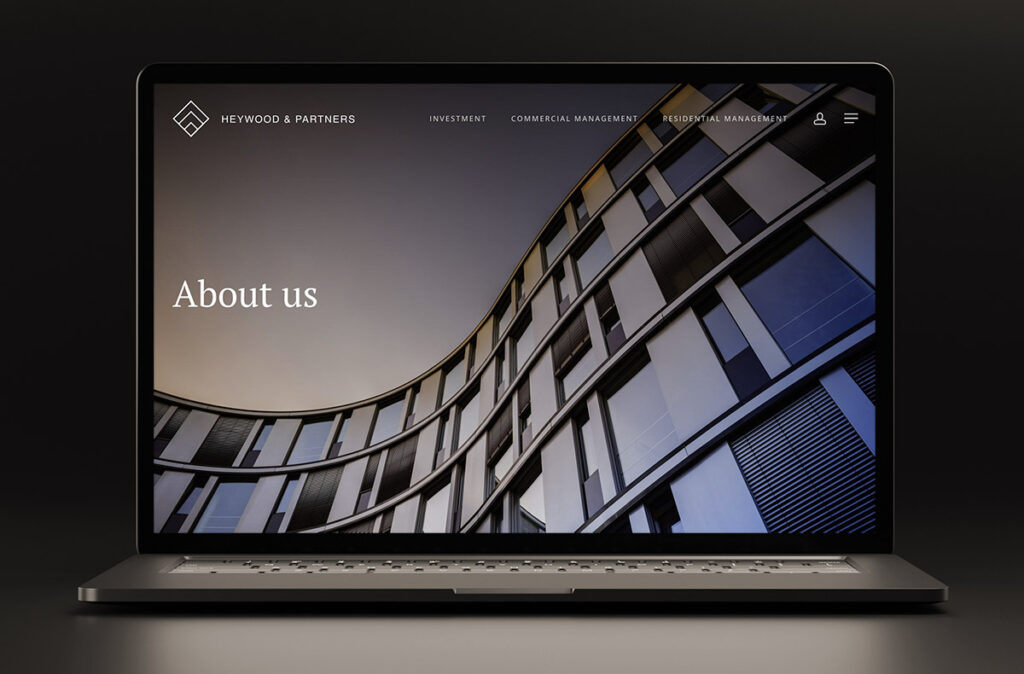
Website design for financial services
Our finance web design services cater for the design requirements of financial companies who need to demonstrate professionalism and credibility when working with a discerning client base.
Finance web design
Reactive specialises in tailored web solutions designed to cater specifically to the needs of the financial sector. Our brand identity and financial website design solutions are designed to elevate finance companies in order to attract the attention of large corporates or high-net-worth individuals.
With an in-depth understanding of the diverse sectors within the financial services market, our agency is uniquely positioned to design your finance website design & branding.
Our expertise in website design for financial services is earned through of over 20 years of experience with investment, private equity and asset management companies. It’s this knowledge that makes us one of London’s top choices for providing web and graphic design services to the financial sector.
Why choose our financial web design services
Experience
We have over 20 years experience designing brands & websites for the financial sector from Fintech web design to private equity, VC & family offices.
Quality design
Our mature & considered approach to designing for financial services ensures a quality outcome suited to a discerning customer base.
Mobile ready
All of our financial website designs are mobile, table and desktop ready. We test thoroughly on all platforms to ensure that your site is accessible to all users.
CMS
You will be able to self-manage all aspects of your web design from a content management system allowing you to create and edit pages anywhere where there is an internet connection.
Your questions answered
How do I know if my finance company needs a new web design?
Web design is constantly evolving, and it is crucial to keep your website up-to-date if you want your financial business to have a strong online presence. Usually it is best practice to review your finance website design every few years. Consider the following for your financial website design:
- Do any pages/sections look outdated? Do your competitors’ websites look more modern?
- Does your homepage load quickly? Do pictures and videos appear straight away?
- Does your site work well on mobile devices?
- Has your website consistently gained traffic over the last few years?
If any of these points do not apply to your website, this is a cause for concern. You should consider updating your financial services website design soon, or risk losing potential customers.
How can a new web design benefit a finance company?
A financial company website should be able to convey a wealth of important information in a way which is visually appealing and easy to digest. A new web design can help accomplish this easily. We make sure every financial website design we develop is not only striking and unique, but also functional and able to display any information you need.
Your business website design also needs to be consistent with your current branding in order to build familiarity with customers. When redesigning any website, we thoroughly research your company’s branding and build your website to fit your brand accordingly.
How does Reactive’s finance web design process work?
We thoroughly research your finance company and brand before starting any web design work. We also take into consideration any existing websites that you like.
First, we can provide to you a basic black-and-white wireframe, outlining the structure of your new web design. Once this is approved, we move onto the design stage, producing a fully-designed website plan. Following this, we will build the website in our online development area, and work closely with you to implement any feedback or new additions.
What information should a website for financial services contain?
A website design for financial services should showcase your company’s overall vision and values. You will want to provide customers with details of your company, your history and what products/services you provide. Your website should also be able to showcase all of your contact details – if you are a big company with many office addresses then these should all be viewable.
It is highly recommended for a financial website to have a blog for business updates, as well as a portfolio page detailing projects you have worked on in the past.
What details do I need to provide for my new web design?
You can provide us with any text, image or video-based content you would like to showcase on your new website.
You can also provide to us any existing branding assets or ask us to design a new one for you. This includes existing logos, colour schemes, brand identity documents and more. We will thoroughly research your brand prior to the start of the web design process.
Discovery
We learn about your company, vision & goals and understand your target audience and their requirements.
Planning
We craft detailed strategic roadmaps that align with your objectives, ensuring every step moves us toward your business goals.
Development
Our team brings concepts to life through innovative design and development, focusing on quality and attention to detail.
Launch
We execute with precision and provide ongoing support to ensure your project achieves its full potential in the market.
Services
Web design
Whether you are launching a new finance website design or tweaking your existing site, our London web designers transform your vision to create impactful digital solutions. A contemporary digital presence can be a clear differentiator and create a memorable first impression.
Web development
We work with our clients to create financial website designs that are user-friendly, achieve results and generate a return on investment. Our knowledge and expertise helps us to balance aesthetic appeal with functional design.
Brand identity
We help elevate finance businesses with a brand identity design tailored to their target market. A well-defined and consistent brand conveys professionalism, reliability, and expertise.
Digital marketing
Alongside our financial web design and web development offering, we will design and execute engaging campaigns to ensure your business gets the attention it deserves.
Hosting & support
We’re proud of the websites we design and therefore it’s equally important for us to preserve continuity of service. We routinely host finance websites and provide routine maintenance to ensure your business is online 24/7.
Pitch deck design
Alongside our key services of finance web design and brand identity design, we also offer assistance with the design of finance pitch decks, financial reports, monthly newsletters, PowerPoint templates and business stationery.


