What is a homepage?
A website is a space where your business exists online. The homepage is essentially the heart of the website which feeds into all of the channels of your site, therefore is an integral part of the anatomy of your online identity and is the hub which keeps the rest of the site ticking over. The homepage is the base from which the website can operate.
For the most part, the homepage of a website is the page that gets the most hits and it initially where the user session begins. If you are using a search engine to find something online you will usually be directed to a website’s homepage in order for you then to make a decision as to whether that company or business have what you are looking for. Sometimes, if it is a very specific search you will be directed to a main product page but more often then not a web user will always run by the homepage to gain further information.
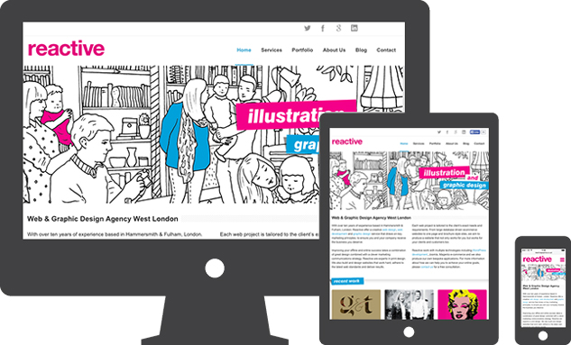
What is the purpose of a homepage?
The homepage is famously controversial in web design for being a place that has varied desired attributes. Some people think it should be stacked full of all the information surrounding your business that anyone could possibly need. Others believe a minimalist web design fares better for a homepage.
I guess something that everyone can agree on is that the homepage is essentially the first impression.
It is the cover of the book. It is the face to the name. Therefore it is essential that the homepage attracts traffic, gives a taste of who you are and chiefly turns those window shoppers into profitable clients.
A homepage for all
Every website is different, therefore it is very important that each website homepage is designed with a company’s particular target audience in mind. This means that the design and development of varying homepages will never follow a particular set of criteria, that being said there are valuable components that are essential to audience engagement and establishing an identity online. In order to address these components it is essential that as a company you can begin to understand the identity of your brand and business. The homepage is often the first page that is designed for a website and is intrinsic to setting the tone and brand of the business.
Before getting to work your web designer/ graphic designer may ask you and your company to think about the following questions.
- What is the identity/ethos of your company?
- How might you approach the correct target audience and allow the homepage to link into the rest of your website?
- Can your homepage communicate compelling content? Do you have photographs, typography, illustration that you would like to include?
- Is it important for your homepage to be responsive?
- What kind of contact details and content can you provide in order to entice prospective clients?
Editorial Associate Gabriel Muller says that a homepage should offer a space that ‘organizes, curates, and creates some order in the chaos’ saying it should feel like home. It should contain all of the essential bits and pieces all under one roof and entice visitors to come inside.
How to create an enticing homepage…
Things to consider:
- Aesthetics
Think about playing with great typography and contrasting colours. Experiment with whitespace while also utilising the screen above the fold. Ensure that you highlight your logo with clever use of textures/ colours. You may also want to animate your ideas using illustration and video and use dramatic photography to visualise your company ethos. - Content
What information do you want to show? Make sure the copy is inviting and fitting with the tone of your business. It is important that you create a buzz for example if you are an ecommerce website launching a new product, make sure that it is displayed clearly on the homepage with the use of relatable language and eye catching graphics. If you are a corporate company it may be more necessary for you to have some in depth text to show professionalism and knowledge on your homepage so that the additional pages can be made more specific. The content also depends on the space within the homepage and can be spread into bitesize chunks if the design is a parallax scrolling site. - Functionality, Usability and Navigation
This is a very important point to consider. The homepage can be a place for creativity however it is important not to try and confuse your web visitor. If the homepage is also too complex certain browsers may have difficulty with load times, which can be a vital component in securing a client. In 2015 we have seen the rise of Parallax sites, responsive sites and single page scrolling sites which seem to contain several pages within the homepage. This means that navigation is critical within the development as the sites need to be intuitive and completely user friendly. - Technology
When designing and developing a homepage it is important that it is built to stand the test of time and can adapt and grow with emerging technologies. It is common that web designers and developers are now working in HTML5 and CSS3 and these technologies are rapidly advancing. Your homepage and whole website in fact should be able to automatically update and be flexible. - Call to Action
A call to action on the homepage is vital. Whether that be a text box with telephone, email, fax options or perhaps a link to a separate contact form. Whatever choice you make with your CTAs they should always be simple for the user to find. Perhaps you would like to include social media icons and perhaps a live Twitter feed, all of these contact options make your business seem live and approachable.
Things to avoid when designing a homepage
- Complex layouts
- Hidden navigation
- Headlines with content only about you and not addressing the customer
- Overkill of company news. The client wants to know you’re active but doesn’t need to read your life story on the home page.
- Stop trying to tell them every single thing about your company on your homepage.
The bare bones of a homepage
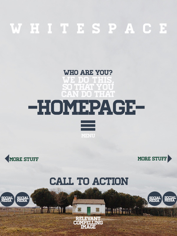
Bare bones checklist
- Is it easy-to-read, in a clear font and enough info but not too much?
- Are your CTAs displayed or is there a link to them visible?
- What do you do? Are you displaying this concisely while also addressing the potential client. eg “We provide web design services, tailor made to your exact requirements.’
- Are you using attractive aesthetics, good quality images and a pleasing colour palette?
- Is it easy to navigate to other areas of the site
- Do you appear to be active and available?
Examples of our homepage designs
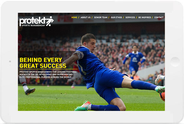
Protekt Sports Management responsive site
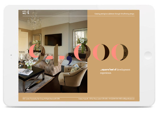
G&T London portfolio site
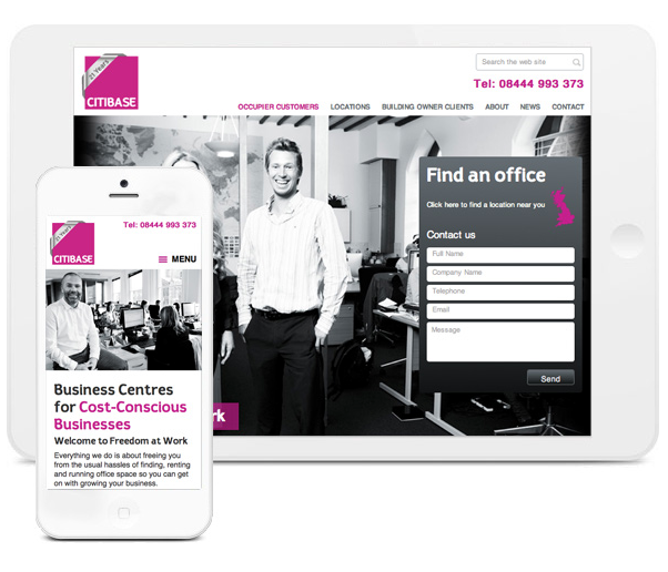
Citibase responsive site
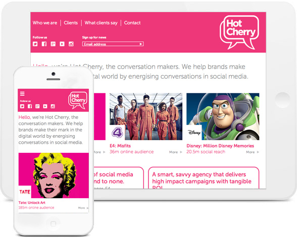
Hot Cherry PR responsive site
Conclusion
Overall, the homepage is a very important aspect to your website design. It is the first impression and the platform from which the rest of the site will run. Think carefully about the overall tone of the site and address within your logo design, choice of fonts colours, images and navigation. The homepage should be a hub for your target audience, a place to get answers, learn something and be directed into the rest of the site.
Here at Reactive Graphics we try to think logistically and creatively about how we can design a homepage that is both functional and aesthetically pleasing. With a vast array of clients who have an equally vast array of requirements for their websites we have designed and developed many homepages that both trends and sometimes go completely against the grain.
We are a team of creatives who can help to bring your ideas to fruition and we can tailor our designs to fit your exact audience demographic.
If you like us to design a homepage and website for you then please get in touch.
If you would like to view our extended portfolio please click here.


