Your website’s homepage is your company’s first impression for most customers.
When visitors land on your homepage, there is little time to capture their interest. On average visitors spend 15 seconds on your website. That is how long you have to capture someone’s attention. The first impression is everything.
A highly effective homepage quickly guides users to their destinations and encourages them to explore the website further. If your website is underperforming, you should consider editing it. A badly designed homepage can make you lose potential customers, sales and visibility. In this article, we will explore what homepage design is, why it is essential and provide you with 11 tips on how to transform your dull page into an engaging one.
Related Articles:
What is a homepage?
Every website has a homepage. It is the main landing page you see when you open a web browser. From here, users can easily navigate to different sections of the website. The overall look and feel of a homepage, including layout, colours, design and shapes, is what we refer to as its homepage design.
But a homepage is about more than just looks. It’s primarily focused on simplicity and making it easy for users to find information and move around your website. That is why understanding what your audience wants to see on your homepage is crucial for making it effective.

Why is it essential to create a good web design’s homepage?
As we mentioned at the beginning, first impressions are everything. People nowadays have a short attention span and typically spend less than 15 seconds on websites. That means you have 15 seconds to grab the visitor’s attention and during this time, the visitor decides whether they leave the website or explore it further. That is why it is key for your homepage to immediately capture their interest with engaging design and content, guiding them seamlessly through your site.
Tips on how to transform your web design’s homepage
In this section, we will provide some tips on how to transform your web design’s homepage to look more engaging.
Design the homepage to look like a homepage
Visitors have certain expectations for a homepage’s appearance. Usually, it starts with a prominent hero banner communicating a clear message at the top of the page. Next, they look for a well-organised navigation menu. Viewers want a straightforward message – so avoid overwhelming the homepage with too much text or multiple CTA (calls-to-action) buttons. Overall, your revamped homepage should welcome readers in without asking too much of them.

Create a powerful hero banner
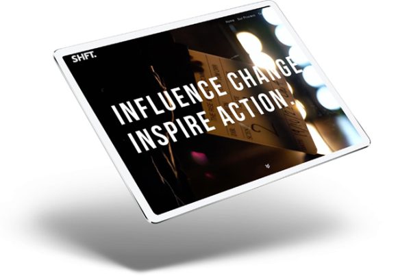
The hero image, as the largest photo on your homepage, should clearly represent your brand. It should instantly show visitors how they can benefit from your products or services. Also choose a hero image that fits well with your brand. An image that doesn’t resonate with your vision and values won’t inspire interaction.
The hero image typically includes:
– Graphical element: This visual image will be the first impression of your company. Hero images often feature people to create a sense of connection. Other images emphasize the company’s value proposition, evoke an emotional response, or include industry-relevant graphics. While static images are the most common, video and animation are becoming increasingly popular.
– The headline: five times as many people read the headline as the body copy. If the headline doesn’t immediately capture their interest, they will leave quickly. Therefore, these five to ten words are essential. Take your time and carefully consider multiple options.
The right amount and type of information
A homepage should give just the right amount of information to catch a visitor’s interest. It should explain what your business does and how it can help them. Plus, it should encourage visitors to explore more of your website. If the text is too long and it is difficult to navigate visitors may get discouraged and leave your website.
Clear navigation
Next is navigation. Place primary navigation in a highly noticeable place. Users should find the navigation easily and quickly understand what the website offers and where to find it. On mobile devices horizontal menus that collapse into a hamburger icon are standard and used by the majority of sites.
Include CTA (Call-To-Action) buttons
Your website’s homepage should interest visitors and encourage them to explore more. Using a CTA is a great way to guide visitors into deeper pages, start the buying process or make direct contact. The easier and more appealing you make it for visitors to click on these CTAs, the more likely they will spend time exploring your website. But remember, you should not include too many CTAs because it can overwhelm visitors and dilute the effectiveness of each individual call to action.
Target keywords
Creating the right message can sometimes make us forget how people find our website, which is usually through search engines, like Google. Your website needs to attract both those who know your brand and those who don’t but are looking for solutions using certain keywords. The main keyword you want potential customers to link with your business should be the focus of your homepage. Make sure it is featured in the H1 tag, meta description, sub-headings and body text in a natural way.
High-quality images and video content
Using high-quality images and videos is essential for engaging users and boosting your brand image. Select professional visuals that match your brand identity and avoid low-resolution or irrelevant content. Thoughtfully arranging these visuals on your web pages improves organisation and enhances the user experience.
Highlighting your products and services
To move users further down the sales funnel, start by highlighting your products and services. Since most users are searching for solutions to their problems, showcasing what you offer helps them find what they need and explore more details.
Social media integration
By adding social media to your website design, you can prompt users to follow and interact on different platforms, which boosts your company’s online presence and reputation. To do this well, prominently display your social media handles on your website – whether at the top, bottom or sidebar. Also include share buttons so users can easily spread your website content on their social networks, helping to increase your website’s impact.
Responsive web design
Responsive web design allows your website to change its layout and content to fit different device’s screens, ensuring users have a great experience. Responsive web design is important because if potential customers are using their phones to browse the internet and your website doesn’t adjust to fit their screens, they will likely leave your site quickly, which can increase your bounce rate.
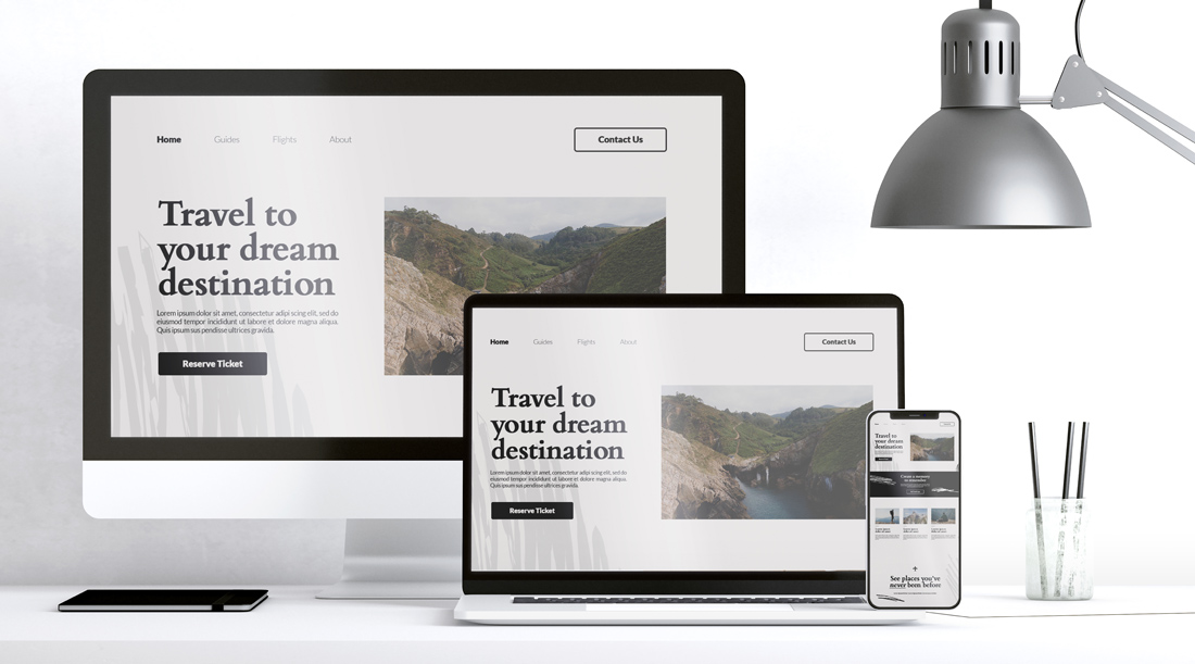
Show what is clickable
A well-designed homepage guides visitors effectively. Highlight clickable elements with colour, underlines or bold text and change the cursor from a standard arrow into another element (like pointy finger or larger dot) on hover.
Your design is an important part of your business. Transforming your homepage from ordinary to professional involves careful attention to design details. Implement these tips to make your website not only look professional but also function seamlessly.
A great homepage is just the beginning of a successful website. To keep generating leads, you need the whole site to work together to attract, engage and convert visitors. If you need assistance with your web design, feel free to contact us.

