Increase conversion rates by knowing your customers is a key component of any successful business, so why should the users of your website be any different?
Monitoring your website users is essential! Not only will it allow you to better understand your audience, but optimising your website based on this information can help you to maximise your website conversion rates. There are many ways for you to monitor your users, below we go through the main steps you should be taking.
1. Analytics
Using analytic tools such as Google Analytics is essential for website owners as it can tell you a vast amount of information about your users. To name a few, you can see the source of each individual user, their age and gender, what interests they have, devices being used to access your website and so on. In addition to this, you can see the bounce rate of your pages, average session duration, and the average pages viewed by your users.

You can also set up conversion goals that will allow you to track when a user has completed a successful transaction; this could be something like successfully filling out an order/contact form or signing up to a mailing list. Once you have your conversion goals set up, you can gather and track your conversions to measure the success your website is having. Ideally, increasing conversion rates and business success.
Using all of this information will allow you to find out what your strengths and weakness are, find new markets, examine any trends and discover the source of your traffic.
2. Heat Maps & Session Recordings
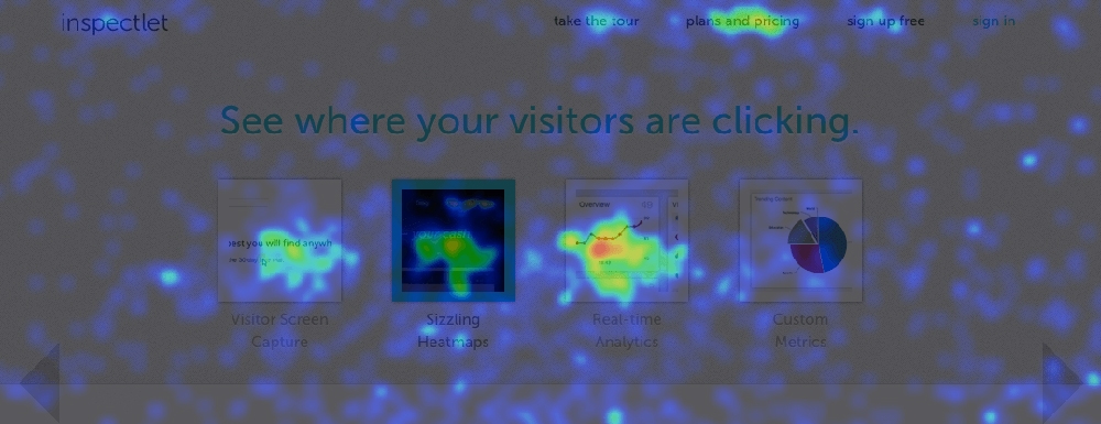
Google Analytics tells you what, heat maps and session recording tools tell you why. Popular sites like Inspectlet and Hotjar allow you to monitor your users’ clicks, mouse movements, eye tracking and monitor how far users scroll down on each page. In addition to this, you can also record a video of your users’ sessions as they navigate and click through your website, highlighting any issues they may be having. This helps identify any usability issues and allows you to see if your users are interacting with your pages the way you intended.

Using both the heat maps and session recordings tools will reveal which parts of your pages are getting the most attention and help you find any potential layout issues your users may be experiencing. You’ll then be able to easily experiment with different layouts, call to action buttons, content and styles to find out what has better reactions. You’ll find in some cases simply changing a colour or position of your call to action buttons can greatly improve your conversions.
3. Colour Psychology
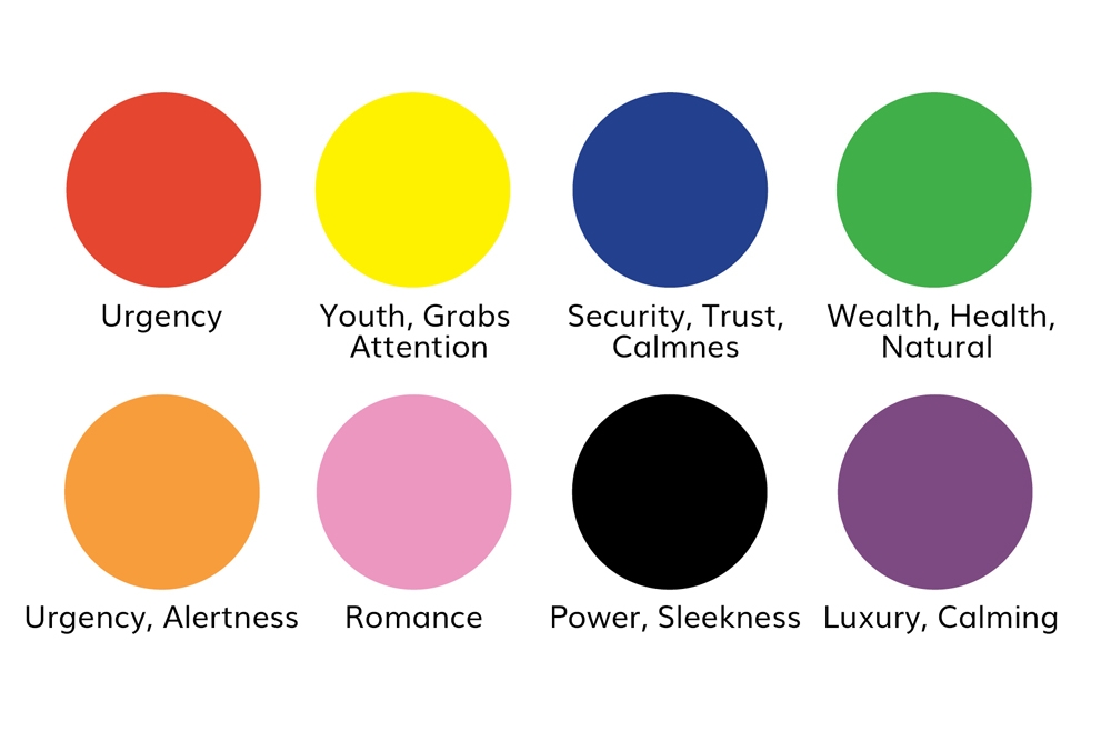
Colour psychology is the science of how colours can have an influence on human behaviour. Different colours can have different effects, and using the right colours will trigger the right emotions to compel your users to take an action. The colour blue for example connotes trustworthiness, loyalty and safety, this is why you’ll see most bank websites using a blue colour scheme. Whereas the colour green suggests wealth, nature and health, this is why most nature friendly or web design for healthcare websites use green in their web design.

Colours can also have different impacts on different genders. Previous studies have shown women have a better response to the colours blue, purple and green. Whereas, studies have shown men prefer the colours blue, green and black, so be sure to be using the right colours for your target audience. Make sure you experiment with different colours and monitor your users behaviour using the tools we mentioned in step 1 and 2.
4. Email Marketing
Email marketing is normally overlooked, but by monitoring your open rates and optimising your newsletters, you can greatly increase the click-through ratio to your website and boost your conversions.
Firstly, you need to maximise the number of users opening your email. The first thing a user will see in their inbox is your subject line, so make sure this is catchy and stands out from the crowd. A good way to do this is by using personalisation and intriguing your users with humour, curiosity and big brand names. Try not to use any spammy language or use multiple unnecessary emojis, which could trigger spam filters.
You’ll find sending your newsletters at specific times and days will convert much better than others, so be sure to test this and use different layouts to find what converts best for your target audience. Also, make sure you have a clear call to action buttons in your campaign. Previous studies show most users won’t scroll down to the end of your message, so make sure there’s one call to action button above the fold of the email.
Conclusion
Using all of these methods will help you to optimise your website while experimenting with different layouts and using colour phycology to your advantage. As result, this will maximise your conversions, increase user engagement, and reduce bounce rates and/or abandoned checkouts.
Contact us today to find out how we can help implement these services for you and increase your website conversion rates! You can also find out more about the other web design and development services we offer here.


