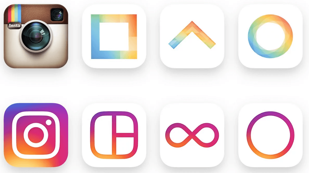
Photo and Video sharing giant Instagram, have had their first drastic re-design since launching in 2010. The app, which has over 400 million active users and is owned by Facebook, have unveiled their new and improved logo and user interface. Gone are the days of their signature Polaroid camera, a globally loved icon. It was, undoubtedly, one of the most recognised social media logos out there.
Along with their new logo and UI, the designers over at Instagram put together this video showcasing how they came up with their ideas. It shows the evolutionary process of how they picked elements from their old design and incorporated them into the new design. Features such as the small rainbow in the corner have become the highlight of the new logo, and they’ve kept a similar shape for the camera.
“When Instagram was founded, it was a place to easily edit and share photos. Five years later, things have evolved. Instagram is now a diverse community of interests where people are sharing more photos and videos than ever before; using new tools like Boomerang and Layout, and connecting in new ways through Explore.
Last year, a group of us started digging into how we could support this evolution while staying true to Instagram’s heritage and spirit. We wanted to create a look that would represent the community’s full range of expression — past, present, and future.”
Ian Spalter – Head of Design at Instagram via Medium
Instagram have been very brave to make such a drastic change to their logo, potentially sacrificing their well known brand identity for something a lot more simple, however they have said they felt the old logo was no longer representative of the Instagram community.

This change isn’t just for Instagram mind, the three sister apps; Boomerang, Layout and Hyperlapse have all been refreshed with new logos that better represent their individual and very different functions. The new rainbow gradient has been used to create much smoother curves and thinner icons that sit nicely over a simple white background. “Less is more” is a phrase that Instagram have nailed on the head with these three extra logos.
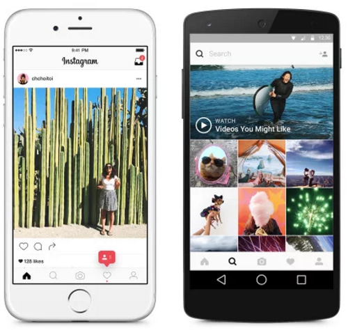
And it’s not just the logo that has had a facelift. The new user interface has been completely stripped of almost all colour and texture, the old orange notification icons have been replaced with a much easier on the eye soft red and the dull blue header bar is a thing of the past, opting for a much more user friendly flat design!

Ian goes on to say “Around the same time we started rethinking the icon, we began iterating on the UI, working to create something simple and clean so that people’s posts are the focus in the app.
While the icon is a colorful doorway into the Instagram app, once inside the app, we believe the color should come directly from the community’s photos and videos. We stripped the color and noise from surfaces where people’s content should take center stage, and boosted color on other surfaces like sign up flows and home screens.”
The UI and logo changes also give the user a more recognisable feel, the icons inside the app have been re-designed to feel less bulky and more minimal. They have made great use of white space and thin lines, bringing the design right into the heart of 2016. The app now sits nicely alongside other social media platforms in terms of design and UI.
![]()
People all over the internet are split about whether or not they like the new logo and UI, but here at Reactive we dig it! Big brands are always changing their logos and web/app designs to match the times, so why shouldn’t Instagram? Let us know what you think of the updates!
And on that note… If you feel your current logo is a bit 00’s (or maybe you’re still stuck in the 90’s… oops), why not consider an update? Our expert UI designer is here to redesign your company logo.
Give us a call, email or pop in for a chat to see how we can help!


