As elements of web design can alter and shift throughout the passing years, something that remains relatively unchanged is the loyal rockface of your brand identity – your logo design. So, if you’re venturing into the new year with a change-up in mind, our top 10 logo design trends 2020 will provide you with designs that’ll impress not just for the new year and might impress until the next decade!

In 2020, it’s all about animated logo design. Even much-loved logos that have been around for years have begun adding motion graphics in the past five years or so to really elevate their online presence, Firefox being an example of one which has also radically re-designed their logo last year.
Simply creating a ‘snapshot’ of your brand’s core vision via animation is a great way to encourage returning visitors to your web design. It creates a sense of ‘liveness’ that can really engage with your users in a way that 2D imagery is limited. Logo design trends 2020 are beginning to steer towards creating a sense of excitement for users, through the use of gifs and moving objects.

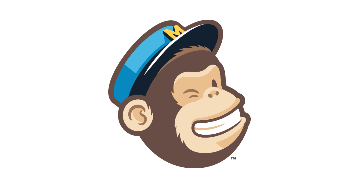
A rising logo design trend for the daring designers out there, is experimenting with a cartoon design. They’re a great way of subtly telling an audience that your brand is ‘friendly’, especially if you are in an online sector, which may be lacking in human interest elements in your web design. We predict that one of the leading logo design trends 2020 is the rise of cartoonish and friendly characters that’ll be popping up more online as we’ve seen in various food packaging and delivery services.
In the hall of fame of cartoon logo designs, stand figures like Mr Pringle and the Starbucks Lady, which have been around since the late 1960s to early 1970s. With both designs having faced a sequence of re-designs, cartoon logos have been able to capture audiences on a global scale becoming recognisable in most households.
In the age of digital design, hand-drawn custom cartoons are making a huge come-back and we’re excited to see more from this logo design trend in 2020.

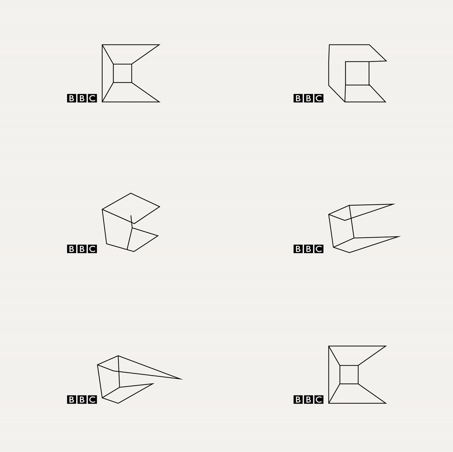
The logo design market is often saturated with the over-simplistic and at times, uninspiring use of rectangular and circular shapes. It can often seem like it’s an after-thought following a brand name. This year, designers have taken inspiration from the playful logo design trend of ‘Low-Poly’ design. It favours a refreshing and softer take on geometric design, and is a logo design trend that’s the Minecraft of all logo designs. Popular amongst web designers and gamers alike, low-poly logo design gives a 3D element that feels alive and vibrant.
The ‘refreshed’ geometric logo trend in 2020 is proving that dodecahedrons really can bring sexy back.

It’s rather easy to overlook logos which take a more minimalistic approach, due to the seemingly saturated design style. However, a simple message can really go a long way. And a good logo can sometimes involve the most basic details. Headspace, the meditation app is a prime example of this. Their statement orange logo has been a flexible addition to their brand identity, standing as the backdrop for creative designs surrounding it that are updated on a regular-basis, it’s a worthy brand logo that is easily recognisable and is pleasing on the eye. Mmmm, feeling zen already.




Instagram’s logo has seen years of small tweaks and changes here and there, but its latest update back in 2016 caused a lot of discussion. Back then, colour gradients began to be used as a dramatic design approach, with many companies saving money in scrapping the scribbles on the drawing board and simply adding colour.
Apple and Spotify billboards dominated the streets of central London last year and in the underground, with large dual gradient text mapping being used to promote their products such as the new iPhone X and iPhone 11.
Facebook introduced a new, gradient brand image (as a representative of Facebook Family of Apps).
With the arrival of Instagram TV, the design style is hard to miss in similar apps too. See if you can spot this simple technique being used by brands near you.
What’s great about this logo design trend 2020, is how cost-effective it can be, incorporating this design style is a fantastic way that UI designers can transform pre-existing logos into a 21st century professional look. All you need is a bit of vibrancy and you’re well on your way.
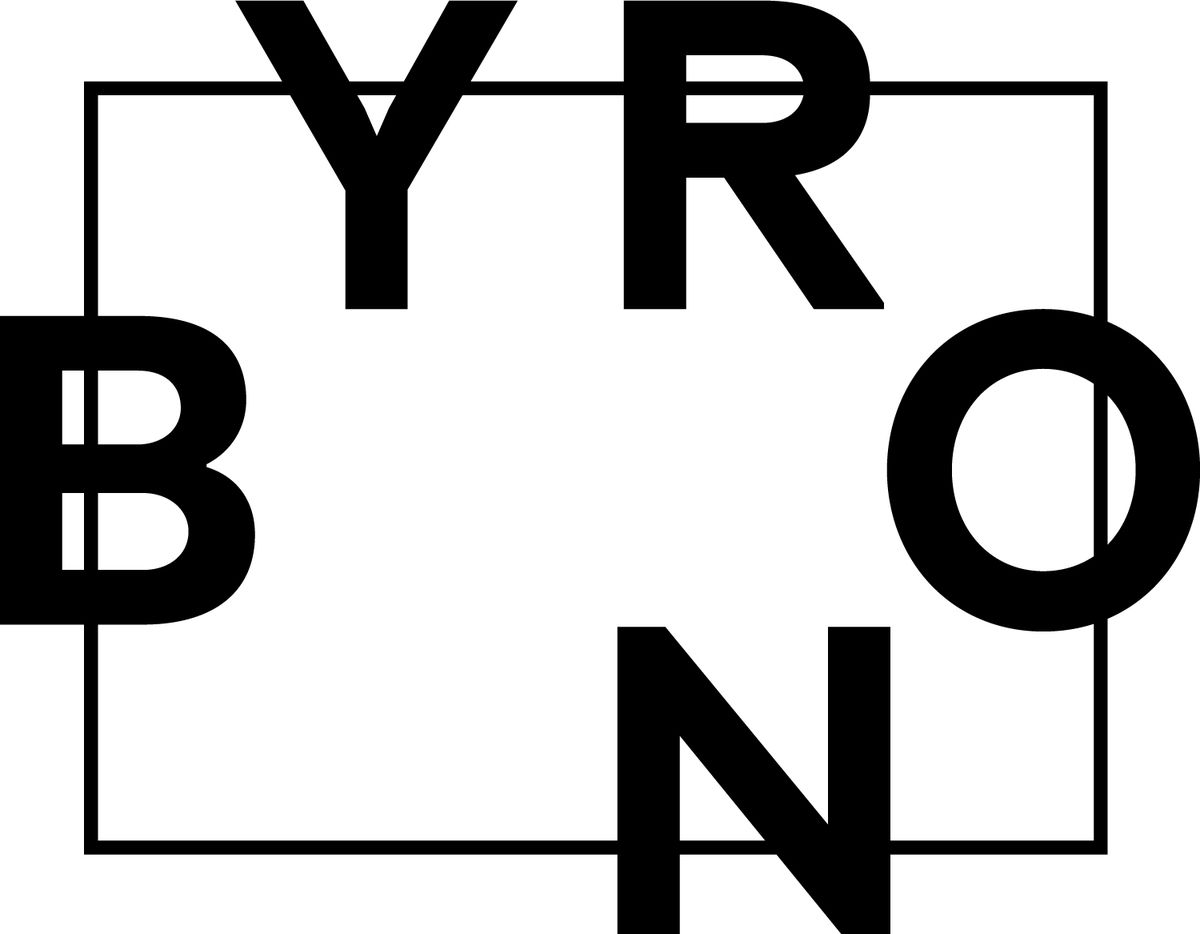
Byron is a great example of how spontaneous logo design is a sure way to stand out from the crowd. Evoking a sense of both fluidity and intrigue, the burger joint is stepping out of a logo design they have presented for years and opting for the clustered, minimal and loose approach to their recent logo design. We like it a lot, and here are some other brands that are utilising an artistic approach with loosely designed logos that perfectly capture originality at the heart of their design process.



In the decade which hailed kombucha, craft beer and cold brews, we’ve experienced a reality of a ‘rise of the vintage’ logo market. Accompanied with flamboyant creative illustrations, the UK craft beer market is a front-runner in adopting this trend. But can the same be said for online companies and brands? Absolutely. Here’s a collection of some logo brand ideas that are adopting this nostalgic and gritty appreciation for vintage typography, able to strike the perfect balance between old and new with their online logo design. It might be something to try out yourself!
It’s a sure favourite logo design trend amongst many UI designers, the subtle transparent overlay of both text and colour enables your brand to explore colour, without it being too overwhelming on the eye. Sophisticated and warm, dual colour components provide a sense of coherence and works really well if you’re experimenting with text mapping in your web design too. Look at ‘Colour gradient’ too, as these designs work hand-in-hand.

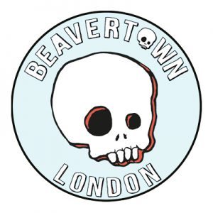
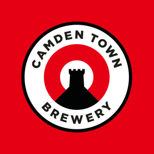
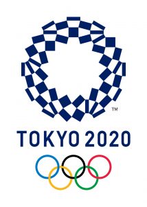


When one thinks of emblems, perhaps a football team or event will spring to mind. Banners, characters and punchy font is often captured within a circular template or rectangular frame. However, and Likened again with the rise of ‘vintage’ typography, a logo design trend in 2020 currently turning heads is the use of emblems and stamp-like logo designs to promote modern products and services. Emblems are easily recognisable, unique and there’s a lot of creative freedom to be had in the creation of custom typography and illustrations often presented.
Graceful white typography laying in front of dramatic black backdrop logo design is a marriage almost older than time itself. However, designers have been stepping out of their comfort zones this year by adding animation to their monochrome logo designs, creating a swift and dynamic designs fit for a 2020 audience.

We really hope that some of these top 10 logo design trends 2020 will help get your creative juices flowing. To conclude, the core take-away from this is to explore the different trends of logo designs but also maintaining a firm grasp of originality at the centre of your approach.
If you enjoyed reading this and would like to hear from our experts specialising in the field of logo, graphic and web design – we’d more than happy help and solve any queries you may have regarding any of these topics. Contact us here.
You can also check out some recent blogs, where we have discussed similar web design solutions in our exclusive news and reviews page.
