What is minimalism?
The Dictionary definition of minimalism is:
-
- A school of abstract painting and sculpture that emphasises extreme simplification of form, as by the use of basic shapes and monochromatic palettes of primary colours, objectivity, and anonymity of style. Also called ABC art, minimal art, reductivism, rejective art.
-
- Use of the fewest and barest essentials or elements, as in the arts, literature, or design.
- A style of music marked by extreme simplification of rhythms, patterns, and harmonies, prolonged chordal or melodic repetitions, and often a trance-like effect.
What does minimalism mean in web design?
Minimalism has been in and out of design fashion for many years and with minimalist web design being dubbed as one of the hottest design trends to watch out for in 2015, we can’t help but notice it modestly popping up all over the place.
Minimalist website designs have many design benefits including:
- Quicker load times
- Taking up fewer server resources
- Faster to develop then complex graphic designs
- A professional and clean look
There is something super trendy about minimalism in design however and where, as in most places, it is used to enhance the user experience there is also that sense of hipster vagueness if it is not correctly executed.
Minimalist website designs have many potential flaws
- Just too minimal – missing important information in order to keep a strong aesthetic
- Undefined – some designers find it difficult to be concise and capture the essence of their clients’ works, rendering the website unclear and vague
- Nowhere to hide – minimal design offers no room for error and the tiniest spacing error will stand out like a sore thumb
Before the explosion of minimal ‘flat’ design web designers and developers were working with highly embellished, completely crammed and cluttered digital landscapes that were meant to offer the user as many options as possible, because that’s apparently what we all wanted.
When the world wide web first boomed into our lives, people just wanted to know how much you could do and how flexible it could be and therefore minimalism just didn’t seem to have a place. It’s like when you’re a kid and you first start wearing make-up, you lather yourself in it using every single product you can get your hands on. Then, as time goes on and you become more aware of yourself and the person you want to be, make-up becomes less essential and you learn how to highlight your best features.
That’s the beauty of minimalism. Highlighting the best features.
Obviously the aesthetic style of minimalism is not to everyone’s taste. However, as we evolve in this century of modernism it has become apparent that design and innovative technologies are often built around the simplest of designs. This is further relevant as public expectations and attitudes towards modern technology and web content are becoming more and more important in regard to the success of a business and client/company relationships.
The new generation of kids on the block are used to the simplicity of minimalism and you can see many modern technologies becoming more and more intuitive. This could simply be because we are living in the digital age and we, as a generation, are becoming more inclined to encounter technology within our day to day lives so we are more resilient to these advances and ergonomic design.
Is minimalism another word for boring?
No. Minimalist design isn’t just about applying the minimal amount of effort, in fact the opposite applies. Minimalism is so difficult to get right, especially in web design. Imagine you are in the middle of a large space surrounded by a crowd of people. Now imagine the same space however you are alone. When the space is active and full of people it is difficult to notice the finer details because there is so much going on visually. However when you are the only one there the space is open and laid bare for all to see. There’s a vulnerability in minimalist design, with each component exhibited in all it’s glory.
Examples of minimalist website design:
Minimalism in webdesign is a delicate technique that, if executed correctly, can offer amazing UX and show off all your best bits.
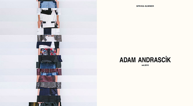
Adam Andrascik Fashion Design
This monochromatic design features a layered image that interestingly forms fragments of a larger gallery of photographs. The simple typography stands out and is clean and crisp alongside the somewhat quirky designs.
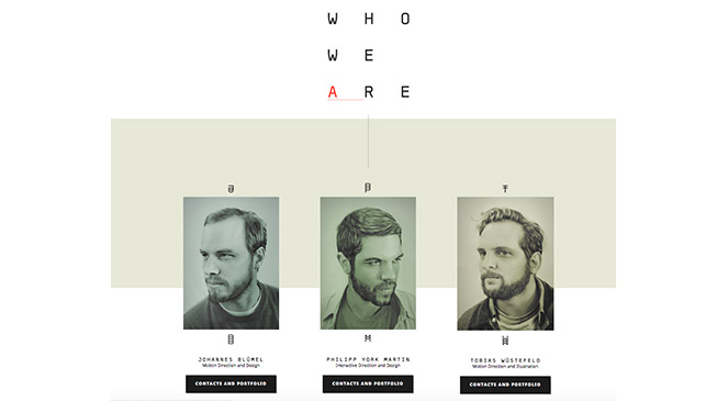
Another Pony Designers
This website design combines lots of white space, simple typography and a sleek parallax scroll that allows each section of the website stand alone.
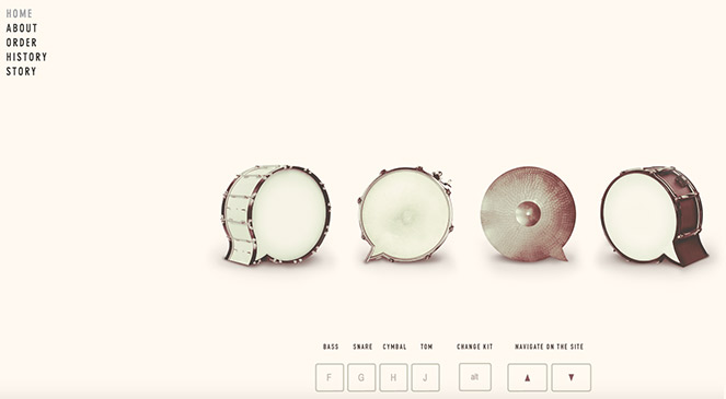
Beatbox Academy
This strong visual and audible design combines clever illustration and a simple structure which renders the site very user friendly and easy to navigate.
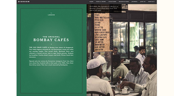
Dishoom Bombay Cafe
If you live in London, you’ve probably heard of (or been lucky enough to visit) Dishoom. Their website is a parallax scrolling design that uses minimal components and allows the content to speak for itself. Much like their food, the Dishoom website doesn’t need too much embellishment as the simple presentation and design shouts cool and contemporary all by itself.
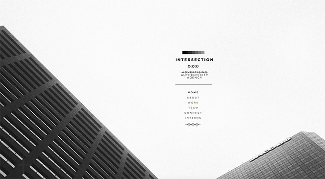
Intersection Advertising Agency
The Intersection Advertising Agency website screams 2015. With minimal information and large full screen images this design ticks loads of design trend boxes for this year. What Intersection fails to offer however is a responsive, mobile friendly design. In some areas you have to try and figure out how to navigate it – but despite that it is a beautiful, mainly monochrome (again) web design.
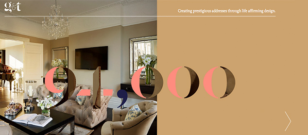
G and T London
One of Ours. Reactive Graphics designed this sleek minimal, parallax website design for cool company G and T London.
If you would like Reactive Graphics to design a minimal website for your company, please do get in touch.
Or to view our portfolio of work click here.
