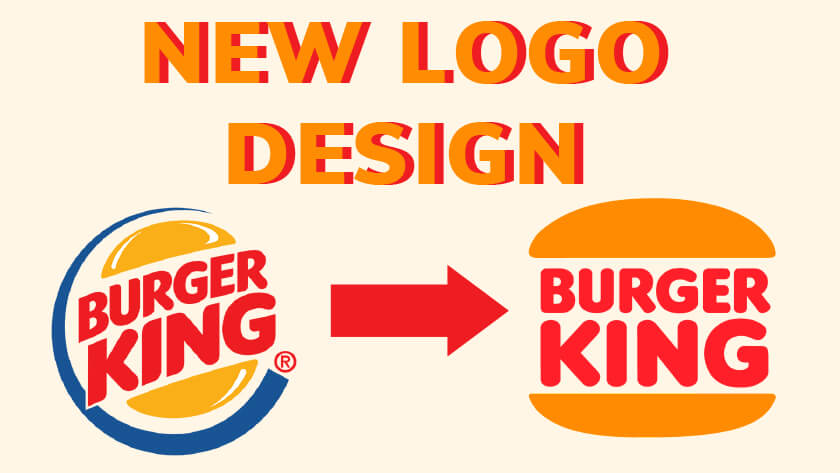
Burger King has unveiled a new logo and brand identity, making it the first complete rebrand in over 20 years. The company is seeking a more natural, old-fashioned look, with minimal noise and colours like red, brown, and green that customers already associate with food.
The announcement also signals a commitment to the recent improvements to taste and food quality by the removal of colours, flavours, and preservatives from artificial sources from their menu. The fast-food chain’s redesign brings back a 60s logo and introduces a brand font inspired by the shape of its burgers, with a rich new colour palette, to create a more digital-friendly identity.
If you are looking for a more digital-friendly design for your own logo, visit our services page to see how we can help. We have been designing logos and creating strong brand identity’s for 16 years. We can help strengthen your company’s image by creating a brand identity that encompasses your core values.
The New Logo
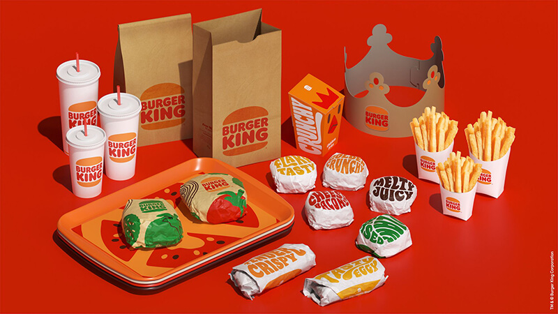
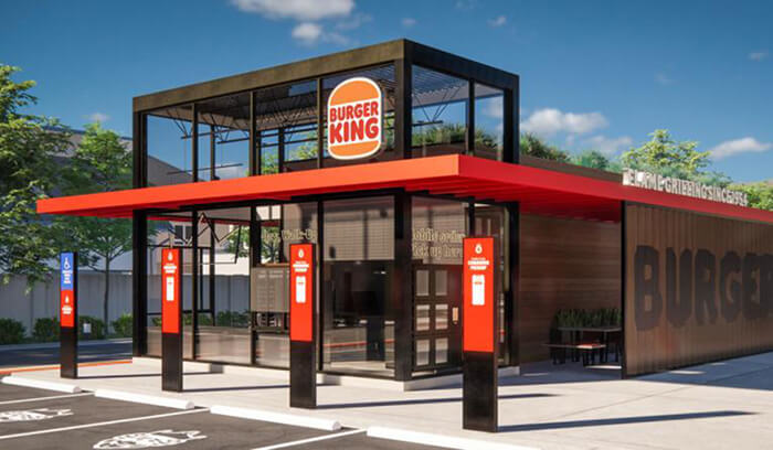
As part of its first rebranding exercise in over two decades, Burger King will be rolling out a new brand logo, packaging, restaurant merchandise, menu boards, crew uniforms, restaurant signage and décor, social media, and digital and marketing assets.
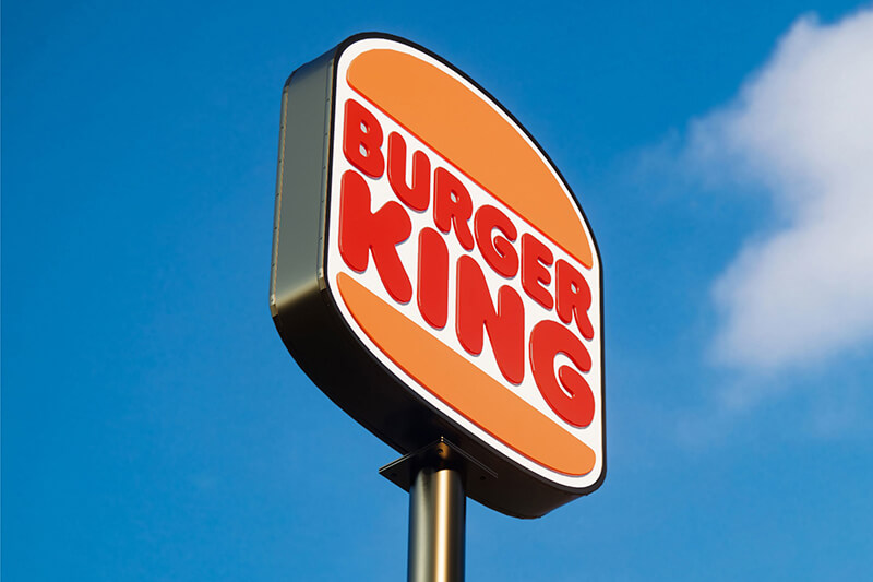
At the heart of the rebrand is a reimagined version of its existing logo, the source of inspiration of this new logo was burger King’s logo from 1996 to 1999. The new logo brings back a classic look with an emphasis on the whopper, putting the restaurant name between the two buns.
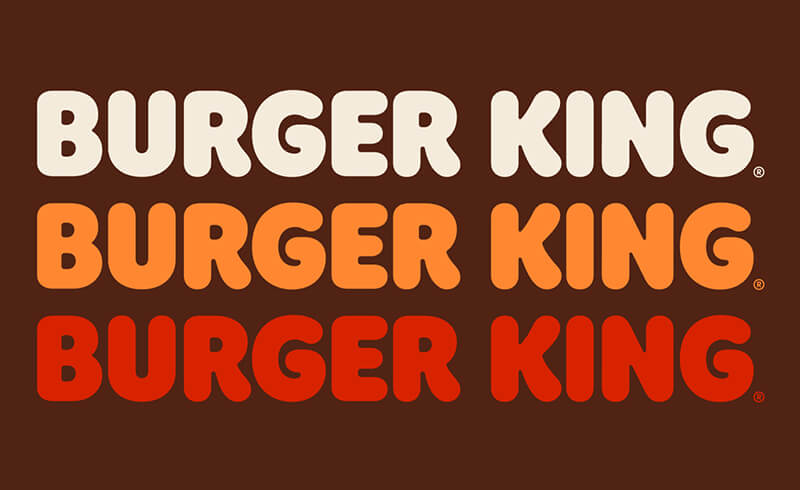
It also includes a brand-new typeface called ‘Flame’, designed to mimic the shapes of Burger King food: round, bold, yummy, playful. Which makes people want to take a bite out of it.
Brand Colours
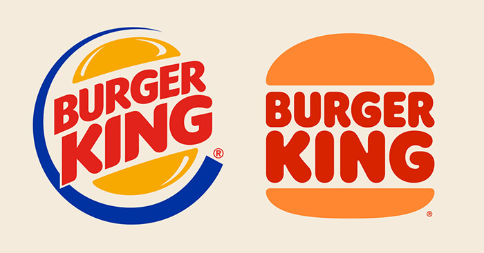
While the colour in the new scheme have necessarily changed from the previous one, the blue from the logo have been completely remove, along with any other appearances. The red and yellow have always belonged to the fast-food industry and the Burger King brand identity operates almost entirely within that spectrum, with a hint of the darker pastels from the same range.
Brown is heavily featured, including in the new uniforms that promote its crew members to masters of the flame grill. The new photography is textures and brings out the sensorial aspect of the food, primarily featuring quirky, saturated illustrations.
Why the new brand identity?
There are two key factors that prompted Burger King to seek a flashy new look and do a significant rebrand: changing marketing trends and changing customer tastes. The elements of this new visual design will be present throughout all touchpoints of the customers experience including the packing, menu, staff uniform, the restaurant itself and their digital presence.
Flat Design Trend
Burger King’s rebrand fully embraces a recent design trend called flat design. Flat design priorities two-dimension illustrations and bright colour and limits the noise created by too many visual details and textures. BK has joined the flat design party, but unlike some other brands, has pulled it off in a celebratory, personality filled way that we just love.
The Burger King redesign serves up a visual style that replicates the shapes of the company’s menus with simple, two-dimensional imagery that has truly little detailing or distraction. It is streamlined, simple, and exciting to look at, which is crucial when fighting for every second of attention from potential customers.
Flat design is so commonplace now that you probably did not notice it because the new branding is already live there. For example, in-store technology like self-service checkout screens and on our phones in the form of mobile apps. By moving towards strong colours and launching a bold, curvy, custom typeface… Burger King’s flat rebrand has resulted in eye-catching marketing materials that stand out in a crowded online market.
Customers’ changing tastes
The second reason for Burger King’s facelift is to reflect its customer’s ever-evolving tastes. When customers’ habits change, companies need to move to reflect them in their product offering and overall brand. Over the past decade, there has been a big shift in demand toward healthier foods and less artificial ingredients, and companies have pivoted to include healthier products in their line-up as a result.
That is when Burger King recently announced that its flagship burger, the Whopper, is free of artificial colours, flavours and preservatives, and the new changes are said to signal the company’s commitment to food quality.
The company also claims to be changing from the ground up, making a big push to move away from artificial ingredients like flavourings and colourings and making some lofty promises regarding sustainability in its food, plants, and communities.
Considering all these changes, the company knew their current visual identity wasn’t reflecting their brand anymore. They needed a new visual expression that could reflect the taste and quality of the food through design.
Strong digital presence
As with most major brands, Burger King has a strong digital presence and the rebrand was designed to work across multiple digital platforms.
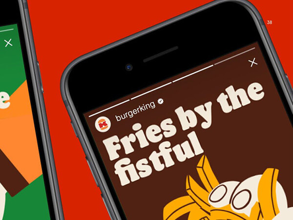
Back in 1969, Burger King didn’t have to worry about internet eyeballs. It was focused on drawing customers from the street and catching their attention on TV and radio commercials. Even in its 1999 rebrand, the design team didn’t have to consider how the brand would translate into an ad on Instagram. But in 2021, even fast-food customers are increasingly found in the digital environment.
A huge benefit of flat design is that it translates better in a world of mobile phones which is one reason it’s used so often in Fintech web design. Because it’s simpler, its design is flexible, easily resized, and adaptable to all types of screens.
Should you follow in BK’s footsteps?
Burger King’s redesign really shows their dedication to their customers and the experience they want to bring through their products. As their business evolves so does their brand personality and attributes.
If your business is also evolving over time it is good to stay up to date with the latest design trends, and keep an online social media presence. Improving your digital presence will keep your business relevant and designed for the future.
One thing we love about Burger King’s redesign is that the new logo pays homage to the brand’s heritage and their brand identity shows confidence in their future, while remaining true to what their customers love about them.
When rebranding your business it is important for it to still be recognisable to your existing, local customers. However it doesn’t hurt to try out some new design trends and see what suites your brand identity.
If you want to build a brand for your business then Reactive Graphics can help.
Get in touch with us today to see how we can get your project off the ground!
To take a look at how Reactive Graphics have transformed clients brand intensities, please take a look at our portfolio of work here.

