The biggest trend in web design at the moment is the parallax scrolling web design.
Here at reactive graphics we can’t stop talking about it. With clients wanting to be ‘down with the kids’ and technology and design evolving at such a rapid pace, we thought we would offer you an insight into what the parallax trend is all about.
For something that started out in classic 2D video games it’s taken the design world quite some time to fully catch on. However over the last couple of years web designers have been perfecting their knowledge of technologies such as HTML5 and CSS3 while developing advanced animation techniques to create page layers and movement that simulates 3D depth.
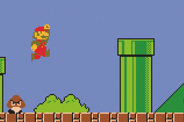 From Super Mario to your website, parallax web design is the trend for 2015.
Perhaps derived from the Greek word ‘parallaxis’ meaning ‘alteration’ the scrolling parallax design offers the viewer multiple perspectives and various modes of motion when browsing one single webpage. It is user friendly and it doesn’t use Flash so there’s also an increased likelihood of it showing up across multiple different browsers. Pretty cool, hey!
So, why is parallax so popular?
Well, the use of the technology gives the user a sense of ownership when browsing the site or as Michael Renaud (Director of Pitchfork) says, “It makes you feel, as a user, that you’re sort of interacting with the page.” It also allows designers to break out of the optimised content world and expand into more thoughtful, intuitive design. The humanness of the navigation of parallax web design allows for each visitor to engage in a different experience every time they visit your website. Parallax design can offer the whole story of your brand to be viewed within a few seconds of first visiting the page. It can also offer a certain tone, from high-flying sleek and professional to super animated, playful and fun, with multiple ways of drawing in a whole host of demographics to your product.
What makes parallax design stand out?
The use of parallax web design gives you the power to draw attention to particular images, logos or chunks of information whilst allowing the viewer to feel completely in control. ‘How can it do that?’ I hear you cry. Well, by directing the user straight to your ‘calls to action’ you are more likely to get hits and visits to your website and extended social media sites. Visitors are much more likely to engage with a website that is responsive and that sparks curiosity – parallax is the perfect way to do that. With users being guided through the information in a very smooth single motion not only will they feel that they are entering into the world of your brand but it’s this type of intelligent, sleek, innovative way of viewing that is proven to increase the duration of site viewing. Thus improving your social media status. Like.
It is one of the most widely used web design formats these days and with all the big brands creating beautiful interactive parallax design sites it is becoming increasingly more desired by businesses as a way of indirectly interacting with their customers and offering them an experience which reflects the ethos of the company.
What are the downsides to parallax design?
Well there are a few teeny-weeny cons of parallax design if not used properly. The design can come across as gimmicky and overwhelming if overused. In terms of SEO benefits parallax scrolling can be tricky to be found as the entire website is featured on one page. This means that incorporate meta-data like tags and keywords are usually at the back-end of your site. But this can be remedied with the help of a professional, say like reactive graphics? Parallax design can also be quite difficult to convert to a mobile-friendly version, this is why extensive checks must be done throughout the web design and programming process. Due to the amount of information contained in one page, parallax scrolling designs can also sometimes take quite a bit of time to load up. So as a society of impatient, quick-clickers we might not have the capacity to wait for the design to emerge.
There’s still hope…
With rapidly changing technology and through working with professional web development designers these issues can be ironed out and your site can truly shine. Plus despite the SEO stuff, if your site is a clean, engaging, well-designed parallax design site there is the potential for it to be shared more widely across platforms like Facebook and Twitter. Copyblogger says ‘if you are connecting more with your audience, then important visitor behaviour metrics are better and your content is likely being shared more widely.’ Great!
So you want a parallax WordPress site?
The use of parallax design is becoming increasingly popular with WordPress. It is possible to animate even the dullest information into engaging content if designed correctly. There’s the possibility for horizontal parallax scrolling, which is perfect for portfolio designs or work examples as it allows the user to quickly navigate and get a sense of who you are as a company. This type of design is also useful if you have several types of services that you are offering, it means the users do not have to do a lot of searching to discover what work you actually do.Then there are the multi-dimensional designs. With multi-layered full width imagery and the potential to add flawless typographical design that appears to leap off the page. Then there’s the single page parallax scrolling, or infinite scroll. With access to all information in one space the user can essentially browse forever, accessing all the relevant content without the need for a single click. Sounds intriguing hey? All the cool people are doing it. Reactive graphics are doing it.
Here are some simple yet super engaging parallax designs that are being viewed on the web right now.
Cyclemon
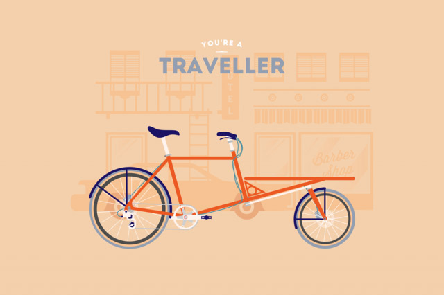 The Cyclemon web design allows for the consumer to browse through all of the print designs they sell, whilst offering an insight into their fun creative brand.
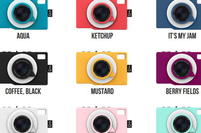
theQ camera – the worlds first social media camera.
This site incorporates both parallax scrolling and a video background. By offering both types of design the user is allowed the space to read up-to-date information whilst having hi-res enticing images to break up the load.
Tinké – stay well technology.
This website is clean and simple with the choice of either parallax scrolling capabilities or click and skip. The website gives you choices while showing off the product beautifully.
Now for the big boys!
Sony – be moved
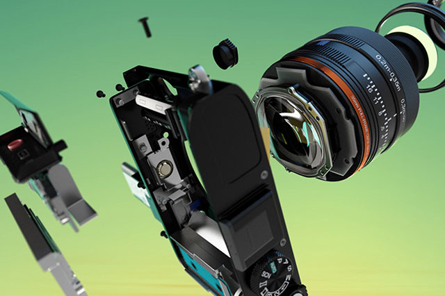
Here the website is no longer just a page but because of the parallax design it becomes a whole world of exploration.
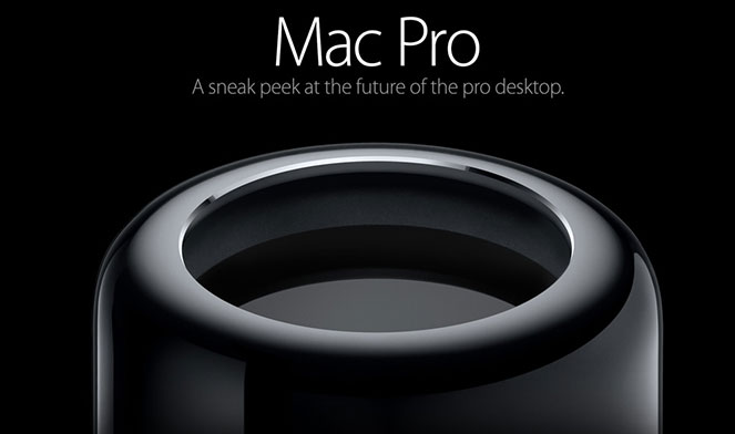
Apple Mac Pro
Here the viewer is lead through the specifics of the mac pro. You feel like you are entering into the world of the engineer.
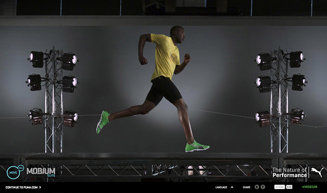
Puma Mobium
Here the viewer can manipulate the images within the page, scroll over a man to make him run and lead the way through various different animations. This has a game-like design that will attract all ages.
It’s not surprising that many huge companies as well as smaller businesses are opting for a parallax webpage as their main web design. It’s functional, it’s interactive and it complies with our innate love of a good story.
Here at reactive graphics we are embracing this evolutionary way of producing web design and we are working alongside great programmers to develop personalised parallax sites that can work separately or with your existing site. We can create something beautiful in design and easy to navigate. If you are interested in developing a parallax web design for your company or would like to enquire about any of our other services then please contact us at:
T: 020 7471 8554
E: info@reactivegraphics.co.uk
Or visit our website: www.reactivegraphics.co.uk
What do you think about parallax design? Is it here to stay? Comment below.
