WordPress design is always evolving as new updates and trends make their way to the forefront of web design. Businesses need to keep up with an ever-changing landscape, which can often be tricky when you are looking for a new website or a redesign.
For any business looking to design a new website in WordPress, it is vital to understand the basic web design principles that underpin quality WordPress design. In this article we cover many of the key points for WordPress web designer to consider.
Related Articles:
Target Audience
Most of us usually buy products and services from brands we feel aligned with. If someone visits your website and sees their values, goals, and priorities reflected there, then they are more likely to purchase from you.
To personalise your website design to your target audience, consider:
• What tone of imagery works for your audience? (professional, minimalistic, bubbly, etc.)
• What themes and topics will your target market expect to see on your website?
• How can you convey your brand positioning through your web design?
• What calls-to-action (CTAs) will your target audience respond to (and where you should put them to optimise your click-through rate)
It can also be helpful to draw inspiration from competitors or brands that sell different things to your target demographic.

Accessibility
Accessibility should be one of the most important web design principles to consider for any website designer or developer. There is no one-stop solution or quick fix for improving accessibility – as web designers we are tasked with thinking of new ways to make websites easier to read and use for as many people as possible.
Because of this, making sure that your website follows the latest accessibility guidelines is one of the first and most important WordPress design principles you need to follow.
Some simple ways to improve accessibility include:
• adding proper image alternative text for people who use screen readers
• creating content that is easily navigable with only a keyboard
• ensuring mobile responsiveness
• adding captions for videos.
However, it does not end there. Incorporating accessibility into web design is a continuous process, and you will notice that many of the web design principles mentioned here will help you create more accessible and inclusive websites.
Colour Scheme
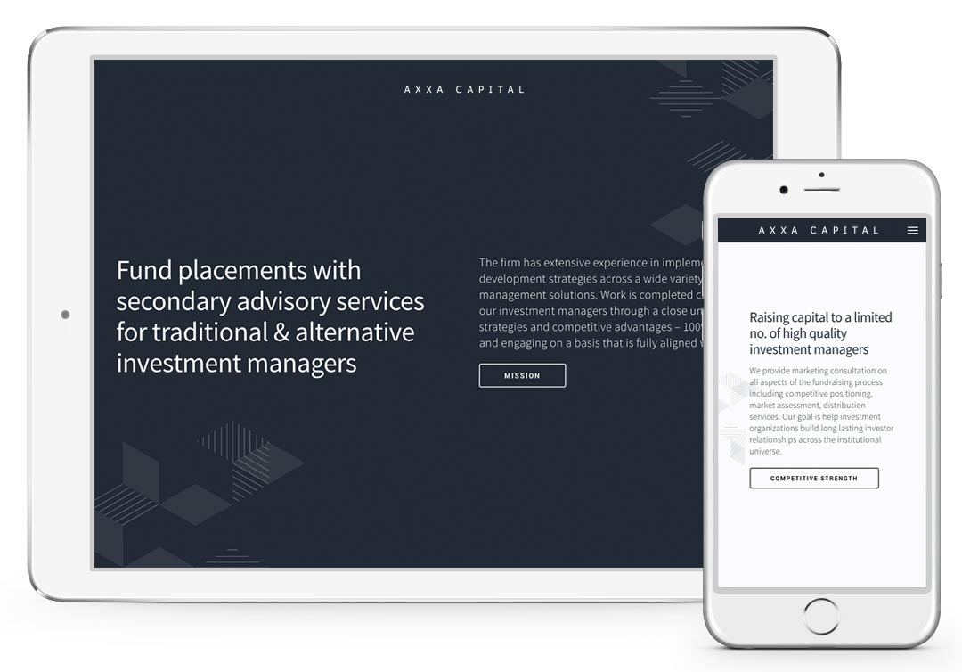
Getting the right colour balance for your website is extremely important. Whether your business already has an established colour scheme, or if you want to start with a fresh palette, it is vital that your web design uses the right amount of colour to create appealing visuals.
Most WordPress themes have a built-in option to choose primary and secondary colours. This means that once you choose a primary colour, the colour of some elements and usually parts of the layout will change automatically. For a more detailed design, add variants of your primary and secondary colour and use them for custom made details.
The most important thing you need to know is what makes an effective colour palette for your web design. Here are some tips:
- Your primary colour should be your brand’s main colour. For example, if your logo and branding is primarily green, then it’s best to use that as your website’s primary colour.
- It also helps to use lighter and darker shades of your primary colour to help you gain depth and achieve a professional look.
- Your secondary colours should compliment (or contrast) your primary colour. For example, an orange/gold colour would contrast well with a navy blue primary colour.
- Add neutrals (white, grey, black).
White Space
Negative space (or “white space”) is the region around the subjects of a page, whether they be images, videos, text, or buttons. Many enthusiastic designers will rush to fill every free space on a page, hoping that giving visitors more information will get them more engaged. However, this often results in overwhelming and confusing pages. Users can only digest so much information on one screen, and over-saturating your website with elements can be detrimental to your business.
This is where negative space comes in. Using negative space emphasises the most critical elements of each page, as the lack of colour draws the visitor’s eyes to brighter areas. This will enhance your key elements and allows you to space out your content so that users do not get overwhelmed.
Mobile-friendly Design
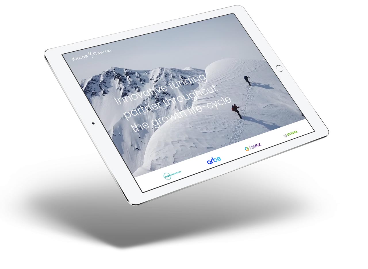
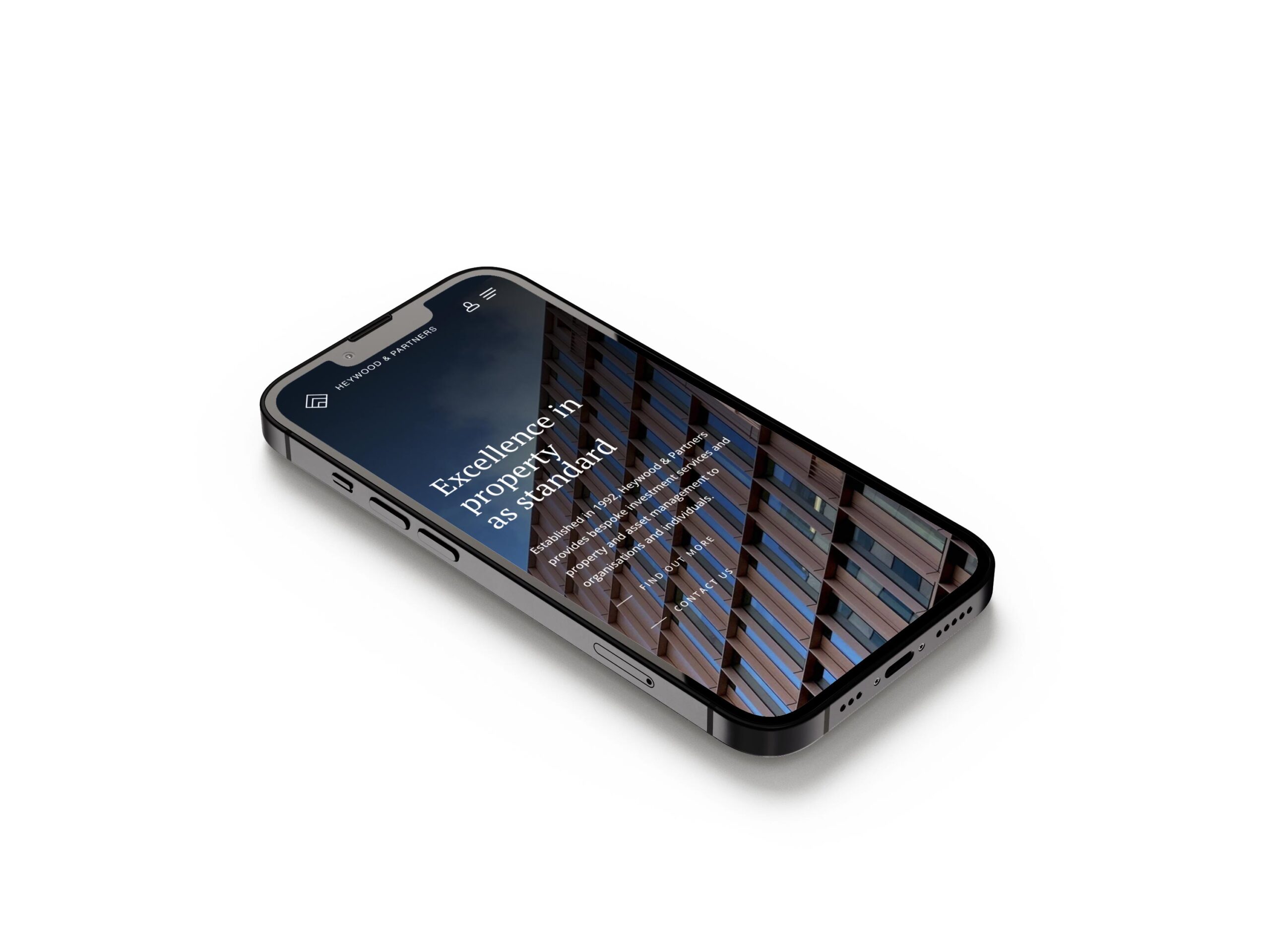
The majority of worldwide online traffic comes from mobile devices. Your financial business can no longer have a website that only functions optimally for computer screens – a sub-optimal mobile layout will lose you a huge portion of potential clients browsing the web on mobile.
All of our WordPress web designs ensure that your content flows just as well on mobile as it does on desktop. This includes:
- Images scaling correctly and optimised for mobile browsing (i.e. a low file size to make sure they load quickly on mobile devices).
- Text scales down to fit mobile screens and doesn’t become illegible and/or roll off-screen.
- Webpage elements need to line up in a cohesive manner – for example, your contact form should not appear before your company’s key information.
Typography
Typography includes the fonts and sizes of your website’s text. Typography affects the ability to read and understand your content. So, what makes for good typography?
- Your text shouldn’t be too small or too large. For body copy, 16px is optimal, with 12px being the absolute smallest size that is still viewable across mobile devices.
- Keep your number of fonts used to a minimum. We usually recommend two fonts that complement each other well – a serif and sans-serif font will usually do the trick.
- Your text colour should always contract well with your background colours. Failing to do this will result in inaccessible, illegible text and put potential customers off your brand.
By following these typography tips, your website can present information in a visually appealing, easy-to-digest manner which can lead to more conversions and subsequently more customers!
WordPress design can be a difficult process to traverse, especially if you are a new business or do not have an in-house design team. If you would like a new WordPress website tailor-made for your business, Reactive Graphics are happy to help. Get in touch with our London WordPress agency today.
