It’s that time of year again, when we at Reactive Graphics take stock and look back at the year we have had, seeing which web design trends for 2018 have been top-notch and which have been a flop. Here are our top 5 predicted web design trends 2018:
Striking video content and fabulous photography
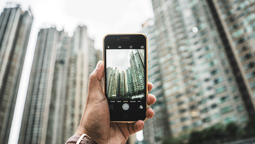
The world is full of outrageously brilliant photography and video content these days. Not only are top of the range DSLR cameras absolutely cheap as chips at the moment, but if you are the owner of a smartphone, then chances are, you are also a pretty awesome smartphone photographer. We are a society obsessed with selfies, Instapics, filters etc. and our collective eye for detail is growing more and more fixated on the perfect pic. Whether it be for your Facebook profile pic, Snapchat story or a Pinterest pin.
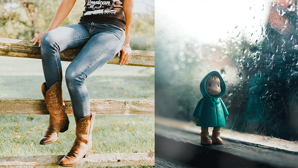
So, if your website is lacking perfection when it comes to imagery, it’s probably time to shut up shop and move back to the 20th Century. Back in simpler times, pixellated pics were considered arty. The fear of falling victim to ‘false internet advertising’ was less real and more humorous. Like when you ordered cowboy boots for your autumn winter wardrobe and they arrived in a matchbox instead of a shoebox and looked just perfect on your nephew’s Woody doll.
So, striking video content and photography is not only about aesthetically pleasing imagery. It’s about accuracy and being true to the services and products you provide. This is vital for building a trusting customer base and providing a service that people would be happy to recommend. Being transparent online is an extremely useful business tactic. If consumers know what to expect from you, then the likelihood of them being let down or misunderstanding what’s on offer is dramatically reduced.
Amazing content not only does wonders for your customer base but also helps significantly with marketing your business. This can be through unrelated ‘sharing’ of your content or reusing your imagery. Either way, you are getting YOUR brand out there, potentially into a different demographic of potential customers.
The hamburger and other delicious icons
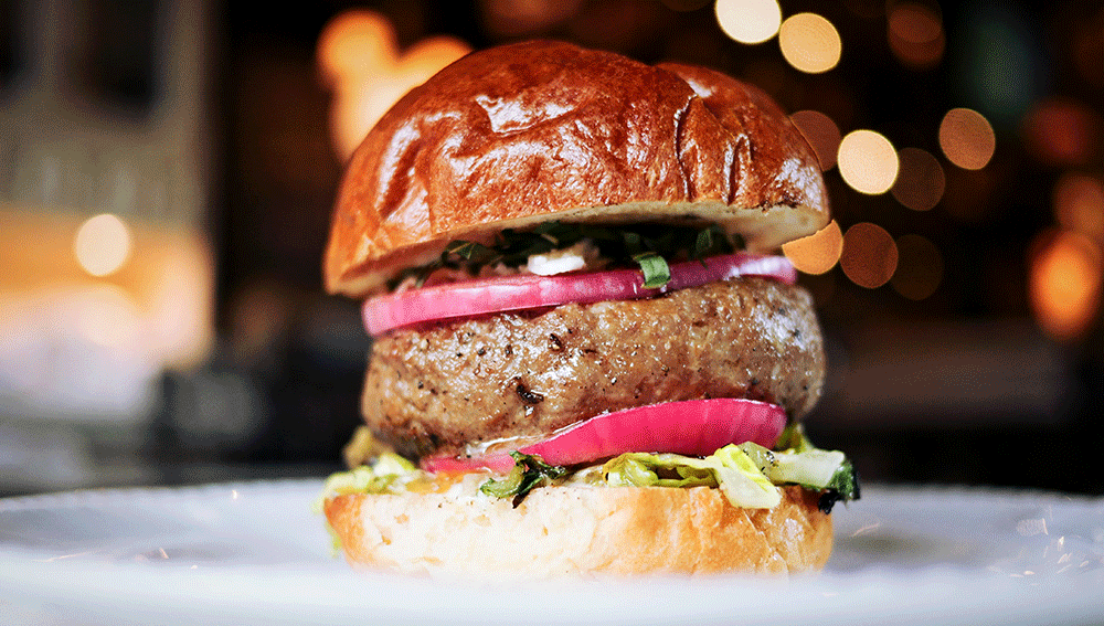
The hamburger menu icon is one of those simple symbols, which will go down in history as one of the most effective. Consisting of three straight horizontal lines stacked one on top of the other – the top and bottom lines being the bun and the middle line being the burger – the hamburger takes up little space and is not restricted by language and can be rendered on all web-enabled devices.
The hamburger really is an icon of our generation, something that has gone from ‘what is the deal with those three lines in the corner of that website?’ ‘Where the heck is the menu?’ to ‘……….’ That’s right, silence. Because everyone now, knows exactly what the function of that simple little icon is. We don’t know how these sorts of transitions take place, from something being completely new and ineffectual, to them being a full-on part of our digital lives. From social media icons, the search magnifying glass or the microphone icon, all of these tiny images are now part of a digital language that we all recognise. Despite them all being, for the most part, is less than a decade old. Awesome, effective icons are set to stay and this brings us straight onto our next point about intuitive design…
Intuitive User centred design
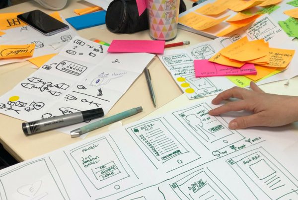
Your website design should always consider the user/customer as the most important person in the whole process. If the interface for your website is not user-focused, then is it unlikely that your customer base will be able to interact with your online business without a hiccup, if at all. A glitchy website that doesn’t do what it says on the tin, is the most annoying thing ever. Equally annoying is a super stylish website that is completely dysfunctional and totally style over substance.
As a website user, you want to feel that your web browsing experience has been developed with you in mind. A slick, easy experience that allows you to do whatever you need in about 4 clicks. Maximum.
Intuitive design means that the customer doesn’t have to do too much leg work to get what they want. YOU as the business owner are supplying THEM a service. By making their experience easier, you are doing yourselves justice.
2018 is the year when slow load page times are just unacceptable. Websites that require flash or any other random plugin to work are completely obsolete. As well as low-quality design, these simply will not be tolerated. So there you have it, it’s the intuitive way or the high way!
Card design ala Pinterest
The card design has been around for many moons and is set to be here for quite some time yet. With its simple, yet effective layout and structure, card design offers a clean, off-beat style of web design that is very ‘Skandi’. Which is very on-trend. Paired with simple sans serif typography and muted colour palettes, card design can take your website from tired to contemporary. Without having to reshape or redesign the whole concept of your site.
Think cool mood boards, retro colours and clean typography. Card design is a minimalist’s dream and set to be a favourite amongst web designers and graphic designers in 2018. Not only does the simplistic design of a card designed website make it easily navigable, but it also allows your content the space to shine.
Long-form content
For years, businesses have refined their content into snappy, short form-focused nuggets of information that are easily digestible. But the times are a-changin’!
Well, not completely, but this trend of making content so short and focused that it could essentially fit into a tweet. This is something businesses are now reconsidering when they design content for their websites. We think the long-form text approach is, naively, something they do because they anticipate it will increase organic web traffic. Unfortunately, this isn’t always the case. Sometimes the best way to approach content is simply quality rather than quantity.

So, here we are, our top 5 predictions for web design trends 2018. If you want to be ahead of the curve and redesign your website or create a site from scratch then please do get in touch! We’d be happy to help!
P.S we are also now on Instagram so come say hi!
