When web design consists of only the essential information a user needs to be able to instinctively use the site, then there will be no more need for designs to continually evolve. Until that point web designers and developers must adhere to flexible design and embrace innovation in order to stay in business. With multiple devices having the ability to get online from desktops to TV’s, web designers are challenged with a digital paradox that balances between the usability and the aesthetics of a website and one must not outweigh the other.
Something that is super popular in website design at the moment is long-format, single-page websites. With usability and clean aesthetic being the top two attributes of a well designed single-page website, it is no surprise that many businesses are opting for this template. Finally web design is being freed of the old fashioned conventional print techniques and allowed to flourish in a page-less world that is cooler and much more elegant than some of the other recent design trends.
Single-page website design
Single-page websites are smart sites that have been adapted to contain all your information in one page on the web. For example the URL that you visit will be the one and only space where you will be directed to from search engines. Many single-page websites are purposefully created without the need to click to navigate. Instead the user can scroll up and down taking in information at their own speed.
This means that single-page websites usually contain quite concise information. The user should be offered all of the information they need but not be bombarded by information overload. Website usability is key and if this is compromised by aesthetics then your website will come across as being very unprofessional. Your information should be easy to navigate, with crisp design however it shouldn’t be a case of style over substance – give users the information they need!
Therefore you must design a single-page website with the user in mind. Not only the user, but the multiple device user. One-page designs often translate beautifully across all devices, but it is important to make design amendments if device usability is important for your site. Fortunately the design structure is quite flexible meaning the single-page technique has been used to design websites for campaigns, businesses, brands, ecommerce, one time events and any other sites that don’t necessarily need to contain pages and pages of information.
The Digital Telepathy blog describes single-page websites as ‘simple, straightforward designs combined with a great story and visceral interactions that propel site visitors along a single path towards that final goal.’
Examples of smart single-page website designs
-
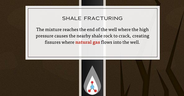
- The dangers of fracking campaign website
A one-page scrolling website dedicated to explaining what resources and materials go in and out of the controversial process of Hydraulic Fracturing.

- The dangers of fracking campaign website
-
- Crated – Art sellers
Crated keeps its launch page simple and effective with three boldly defined sections.

- Crated – Art sellers
Designed for web a single-page site with classy monochrome hand-drawn illustrations.

-
- Life of Pi Story
A one-page scrolling parallax web page dedicated to the journey of Pi.

-
- Scroll for your health
A page that allows you to explore a series of images, teaching the importance of your 5 a day.

- Scroll for your health
-
- Built things
Built Things is a well-built one-pager. Its storyline is executed in a way that makes sense: learn more about the company, what they do, who does it, and how to contact them.

- Built things
The last couple of years have seen a wave of many new design techniques that have been developed in order to maximise the UX including;
- Single-Page sites
- Parallax web design
- Responsive web design
- Minimalist Layouts (Split screen, full screen images, modular or grid based.)
As shown above these techniques also often overlap, culminating in a multi-layered design that offers various different elements and a bespoke user experience. The single-page site has been explored as a responsive and a parallax template that offers all the information in one place but feels like multiple spaces.
The beauty of the one-pager however is (in my opinion) its simplicity. Many large brands and corporate businesses have however taken the trend and sent it flying into the stratosphere with out-of-this world complex web designs. In order to bring the humble single-page website back down to earth I have listed the pro’s and cons of the one-page wonder.
The pro’s and con’s of a single-page website
In conclusion
It is important that all websites have a primary objective and it is particularly important that single-page website designs are created with that objective in mind. Reactive Graphics work differently with every single client, building bespoke services that work for them, their businesses and their clients. Your one-page site should encapsulate all the things you want to present about yourself and display them in the most optimized way.
There are things about a single-page web design that other sites just can’t quite achieve. It’s simple and uncomplicated structure fused with engaging copy, elegant typography and visceral interactions guide the users through a story from beginning to end. It’s more focused than a standard website and much more elegant than a landing page if executed correctly.
If you would like a single-page website created for you or your business then please contact us.
Or for more information about the services we provide please visit our website.
#wearereactive


