The year 2015 has been a big one for advancements in web design and web development. With changes in Google SEO ranking algorithms and with web officials encouraging responsive design and enhanced user experience as a way to improve website usability, now – more than ever – the sustainability and success of your business depends greatly on your online presence. In order to ensure your website isn’t left behind and pushed aside to the deep dark relics of the World Wide Web, here are some simple but effective ways to catapult your website into the 21st Century.
10 simple ways to bring your website up-to-date
- Update text
This might seem like an obvious point, however if you look around, there are plenty of businesses that have not updated their website text at all since it was built. This can include incorrect dates, promotions that are out-of-date, projects that have been and passed and old contact details. By not updating your website text, you are putting your business in danger of seeming inactive and unprofessional. A simple text update now and again shows activity on your site and reassures clients that there is a working business at the other end of the webpage.
- Renew images
Lots of companies use stock images to flesh out their websites. There are many websites that are dedicated to providing images of all kinds. But you’ve got to be selective. Choosing an image of a group of smartly dressed corporate looking people, smiling and ‘high fiving’ is never a realistic choice and rather than making your website look professional and well finished it is possible that the only thing it will guarantee, is laughs. As we mentioned in our visual story telling blog, people relate to businesses who spend time humanising their brand – and real, professional quality, well shot images are the best way to do this. It is also important to mention that some stock image websites, iStockphoto for example, do have a great selection of photographs if you are looking for something specific.
- Embrace Video
As you have probably already gathered video is extremely important in increasing the marketability of products, services and businesses in general. With video quickly taking over the web it is easy to see that the inclusion of video in your website design can prove fruitful in gaining new hits and improving your SEO. It is vital that you don’t just use any old video however to display alongside your brand. You can have a video that explains what your company does quickly and succinctly all using the same colour palette, logo’s, mascots and brand aesthetics that you have created to encapsulate what your brand is all about.
- Alter layout
Many older websites, that were built before the development and implementation of html5 and CSS3 often have navigational glitches and layouts that are perhaps not quite as intuitive as they should be. By testing your site and working out how a visitor might engage with the information you have displayed you can highlight any glitches and represent your content in a more fluid and understandable way. It is important to remember that a layout structure is created to establish aesthetic order within design, so try and balance out the content by not having too much text and not having too many images. This will allow your website visitors a chance to see whats important without being overwhelmed.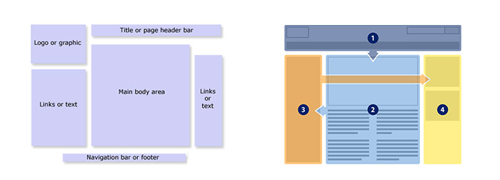
- Embrace white space
This year we have seen this rise of minimal design and flat design which both rely on great attention to detail and the ability to understand the benefits of white space. Overall white space is apparently correctly executed when it goes unnoticed, and it can be more about establishing a contrast within your content rather than just having empty space. White space should be space that has been well thought out. This can help text to stand out, allow you to refine your content and not feel that every pixel has to be covered. White space may help streamline your layout in order to make the website more readable. -

- Social media implementation
I know lots of businesses still avoid it, and surprisingly lots still don’t know a tweet from a friend request, but with the digital age bearing strongly upon us all it would be silly to continue to ignore the power of social media. Not only is it a great way to market your business and create links to your website but it is a good way to engage with customers on a personal level. It shows you are active, it allows you to be readily available (within your own constraints) and it offers you several free platforms to promote your company further. You can implement a Twitter feed or Facebook wall into your website which acts as a sort of rolling news feed. This is a quick and easy way to keep people up to date with your businesses latest goings on. -
- Play up your strengths
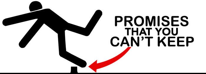
Web browsing is all about speed and convenience these days. Can you deliver what you say you can and how quickly will I know this from clicking on your website? Take a look a your homepage for example, if a customer who needs a service or product visits your website is it possible for them to discover whether you can provide the help, within the confines of 3 little clicks? If not, then it is estimated that your website will see a massive 70% drop off at this point and the customer will search else where. Again it is down to humanising your brand – by seeming approachable, but professional. Play up your strengths and be honest about what you can offer, if you lie and make promises that you cannot keep, then it will surely back-fire. It is important to remember that people do talk (and write blogs, leave reviews and testimonials) so make sure they are saying positive things rather than commenting on your incompetence. -
- Quick load speed, quick search option
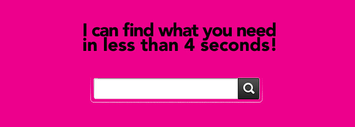
As I previously said speed is one of the critical elements to ensure the success of an online business. With 1 in 4 people abandoning a webpage that doesn’t load in under 4 seconds, it is possible that all your SEO efforts that secured you that initial click through could be rendered obsolete. So make sure your website and all its contents are optimised correctly for web – use this free Google page speed tool to check. So, your website load speed is now super-fast and you’ve managed to get the visitor to your website, now the next step is to make it easy for them to search for what they need, so perhaps you could implement a search bar. This can be very subtle and doesn’t have to encroach upon your website design too much if you don’t want it to. It provides a quick browse option for those who don’t want to leisurely peruse your website. -
- Clever use of typography
Typography is a lettering technique that has been around for decades. Digital typography and in particular vector encoded font usage has enabled businesses to build logo designs and brands around a recognisable word mark or slogan that can be repeated across digital and printed materials with no loss of quality. Typography is aesthetically engaging and has been trending in design for a few years now. By creating an illustrative graphic art work – made with text that actually says something about your business – you can quickly and effectively modernise your website design and overall brand. -
- Ensure you are responsive
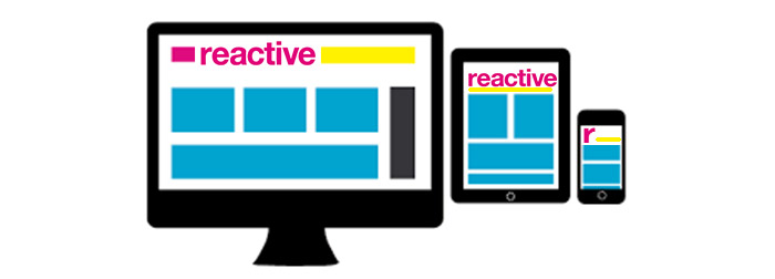
This should probably have been top of the list but I thought it was a little too obvious. Now, quicker than ever, technology is advancing and more and more devices are being designed with the web browser functionality built in. Mobile devices, TV screens and monitors are all getting larger, where as wearable items and other personal devices are all getting smaller. The web must be responsive to these changes. By adapting to the needs and desires of your website users you are opening up your business to the possibility of wider interest and interaction whilst contributing to the sustainability of your online presence.
The ultimate (more drastic, but sometimes necessary) way to revitalise your website
Complete Design overhaul
Sometimes, when a website was built so long ago that it resembles a badly laid out telephone directory, this is when no real amount of development will be able to bring it up to date. Sometimes it is best to just let go, and start from fresh. This means that just by default your website will be modernised, as web designers and web developers are always using innovative techniques for website builds. By making sure the sustainability of your website is a large contributing factor in the way the redesign is approached, it is likely that the overhaul will be worth every penny in the long run.
If you are precious about some of your content, then this can always be transferred to a new website. However it is important to note the tone of your text and to establish whether it is actually still relevant. It is also essential that content like images and videos are updated and optimised to the highest quality as all of these points can have a great effect on the success of your website.
What we can do for you!
Reactive Graphics provide a bespoke service that is tailor-made to your exact requirements. We can update your current website design for you, concentrating on design and layout improvements and help implement new technologies to improve the functionality of your website. We are also extremely happy to redesign websites from scratch and will support you all the way from initial design to development and throughout the launch.
Please get in touch if you need any assistance! We are happy to offer a free consultation over a coffee in our onsite cafe.
