A few weeks ago Google announced that they would be made a subsidiary of parent company Alphabet and Google would continue to grow it’s affiliated companies whilst Alphabet could concentrate on developing some of the larger ongoing projects.
The new Google
This momentous shift has also unsurprisingly made way for a new phase in the evolution of the Google brand and identity. As we know it, Google is one of the most recognisable brands with a no-nonsense word-mark as its main logo enhanced by those four primary colours. The new logo, is effectively the same vibe, only a little clearer, a little simpler and a little brighter.

After reading countless opinion pieces regarding the new google logo it is almost impossible to gauge what initial reaction I may have had. It seems the gif that was displayed on the Google homepage showing an animation of a arm rubbing out the old Google logo and replacing it with a chalk drawn hand lettering style sans-serif font, is the reason behind many people describing the logo as ‘Childlike.’

This is possibly, simply a reaction to the ‘chalk drawn element’ and doesn’t really denote the sans serif type itself. At a glance the new word-mark, is clear, bold and completely recognisable and the lines and curves of the letters appear to be made solely for ease of reading.
Google’s trademark colours still remain. Blue, red, yellow and green but with slightly more saturation and ‘pop’ than before. The idea is to create a Google logo that will have longevity and maximise readability across all devices, all browsers and also have the ability to transform and morph into several different animated sub-logos that add character and expression to every user experience.
Google explains that the new in-house designed typeface ‘allows us to make the design pixel perfect everywhere it’s used, and it allows us to optimize these assets for size and latency, including building a special variant of our full-color logo that is only 305 bytes, compared to our existing logo at ~14,000 bytes.’ Therefore ensuring almost complete compatibility across all digital platforms.
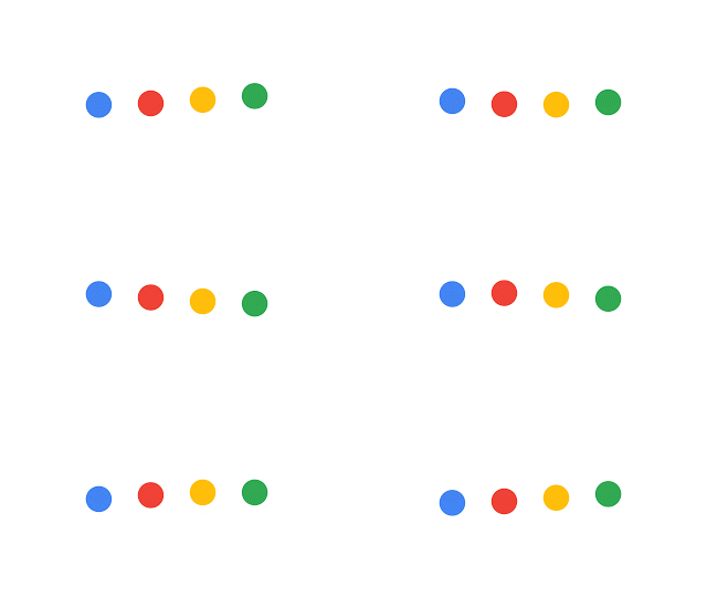
Google animated dots
The animated dots that accompany the new Google logo are each a well thought out ‘expression’ that appear to act intuitively with the user. For each action a user takes Google has an icon to notify that a change is occurring. There’s an individual animation to show when Google is replying, thinking, listening and generally working for you or with you. This morphing status of the logo is a simple but very effective ‘micro interaction’ that shows that the users journey is constantly supported and that each interaction is well though-out

The new favicon
The favicon G encompasses everything that the new Google brand has to offer. It is dynamic, clear and a compact version of the larger logo in order to display precisely across various browsers and screen sizes. As Google expands from desktops, to mobiles, to watches and beyond… the new favicon will hold even more importance as technology advances and the web becomes even more accessible.

Overall
Although the new Google type-face has been described as resembling those colourful 90s fridge-magnets, it seems fair to say that the re-brand was not ill thought out. Each element has its place and every details has had it’s journey. It is very easy to describe something as looking ‘childish’ but effectively this is the birth of a new type of Google. A brand that exists in a different place to the one before. The essence of Google is still very much alive in the logo, right down to the slightly rotated ‘e’ which lives on – ‘Google will always be slightly unconventional.’


