Asymmetric and broken grid layouts
The latest web design trends see brands moving away from the standard grid-based layout that has dominated for years to a more asymmetric and interactive web site layout. The use of filling an unbalanced section of a page with a large image, title or block colour allows the brand to put emphasis on what they want the user to be attracted to and dictate how they’re going interact with their site.
Experimentation of asymmetry has been around for a while now and has always been a means of standing out and pushing boundaries. With the standard grid composition being the favoured layout for websites today has caused web designers to have to literally think outside the box and break away from predictability in order to stand out from the crowd. An asymmetrical layout demands attention, this coupled with subtle animation takes the user on a journey as they scroll through, the unpredictability of where the graphic may go next, engaging their curiosity and interest.
Minimalism and white space
One of the web design trends that is popular as ever is minimalism. Taking the mantra of less is more and creating a simple yet compelling layout. With life moving so fast it’s hard to take everything in, the less your audience have to think the better. The same goes with web sites and if designed correctly it will show the user exactly what they are looking for in no time at all. Having clean and uncluttered visuals has become even more essential for viewing content on smaller smartphone and tablet screens, which in 2019 are used more than desktops. The use of bright colours and gradients lends itself well with this particular trend, a simple colour effect can attract, distract or even evoke emotion.
In 2019 we have seen a further growth in the use of white space. For decades the use of white space has been used to contrast a focal point such as a body of text or an image. More recently web sites have been using an uncommon amount and even making the white sections the focal points. These techniques are a main benefactor for the easy understanding and navigation of a web site.
Large Serif fonts
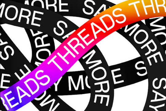
Serif fonts have always been synonymous with print and are often associated with the past. The contrast between serif and sans is used to put emphasis on a particular word or phrase, which still has an impact to this day.
While sans have always been popular with web design due to its easy readability, it is clear to see that the latest web design trend is a growth in brands using bold serif fonts in a decorative manner for headers and callouts. Each font has its own personality and serif fonts can be more diverse than you would expect, a sharp wedged serif font can evoke a sense of authority and stability, whereas one with rounded edges has a more playful feel and can add character to a design. Whatever the style it is always eye-catching and plays great into minimalistic compositions.
Depth and three-Dimensional design elements
With the rise of virtual reality looking inevitable it is not surprising that web design trends are following suit. Although VR is not true accessible to everyone, yet its influences have become evident in web and graphic design. The use of 3D text, illustrations, shapes and animations are being used throughout websites to give it depth, almost making the user feel immersed in the web site, that they’re not just looking but seemingly reaching out to touch what’s in front of them.
Whereas in the past web sites relied heavily on flat illustrations and typography this doesn’t have to be the case anymore and the contrast between flat and 3D also has a striking effect. As technology advances the possibilities are endless for this type of media, so expect to see this trend expand further with rendered compositions that resemble landscapes from distant planets and typefaces that quite literally pop of the page.
Enhanced and elevated images
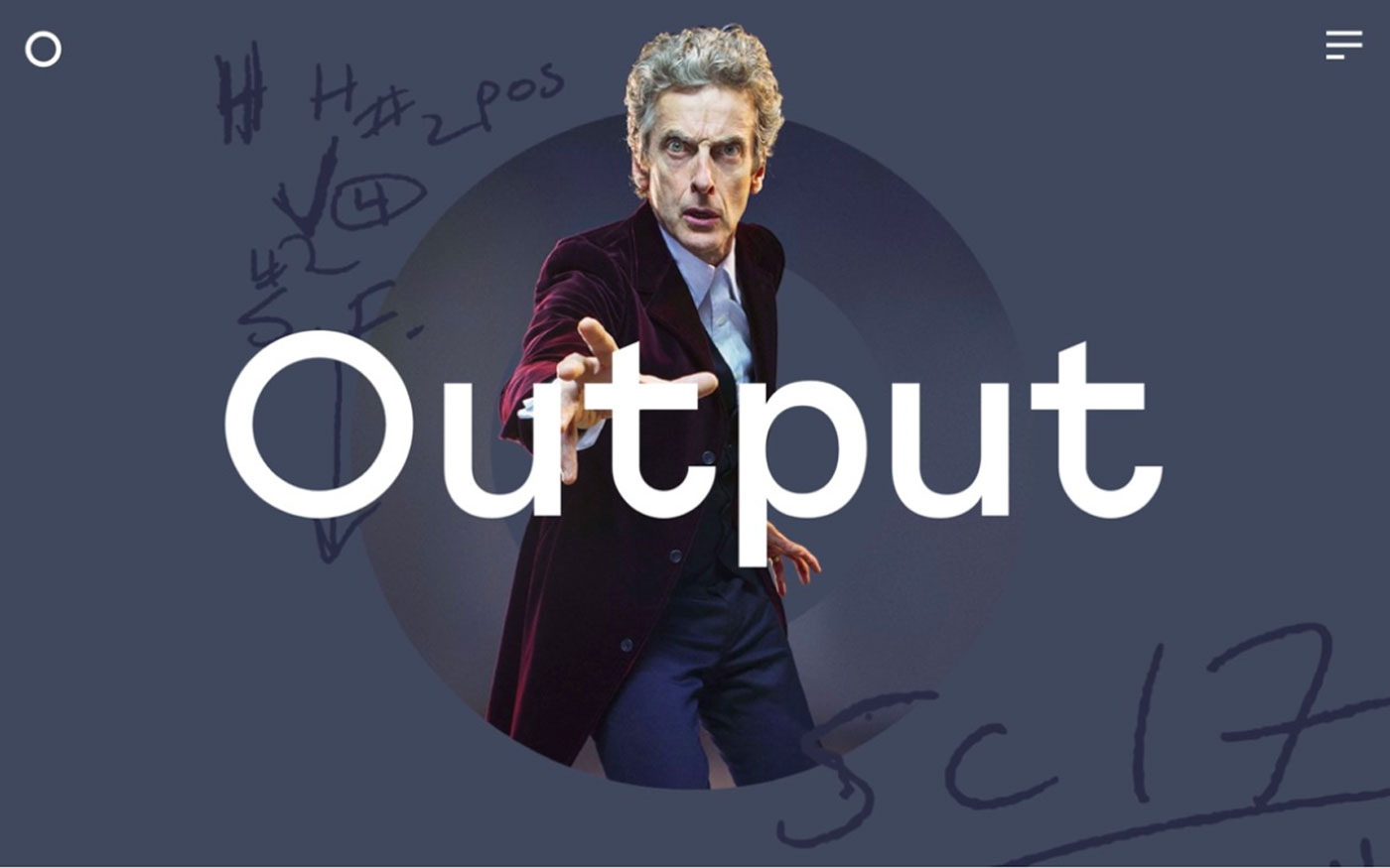
A web design trend that is forever growing is the use of image enhancement. Cutting out a figure then contrasting them against bold colours, adding filters, tones, drop shadows and the list goes on, all of these techniques are used to elevate and draw attention to a particular section of the page. Large bright images are used if the designer wants them to be the focal point and the first thing a user’s eye is drawn too. This can also go the other way and images can be used to distract and lure the users focus to somewhere else on the page, for example making an image monochromatic paired with a bold colourful font helps you focus on the font, but the image still adds character and minimises the white space on the page.
One of the very common web design trends is the combination of real-life imagery combined with flat objects in this case opposites do truly attract. The use of floating images with flat illustrations, shapes or colours can often appear 3D and create an overall abstract aesthetic. This has proven to be popular mainly in fashion and editorial photography and with the growth in VR we expect to see this technique expand further into mainstream website design and advertisement.
More and more video content
Video content is not a new web design trend and the reasons why designers use videos on their pages is clear. Videos diversify a page, they are eye-catching, informative and especially great for the typical “always in a rush” user, who would rather watch a video than scan through a mountain of text.
The reason we are expecting to see more and more videos being used in web design is because Google are prioritising websites with mixed media (the usage of video) above websites without. To put it simply the more videos you have, the more searchable you become, therefore the more traffic and hits your website gets.
You may be also interested in:
- Our 6 Favourite Web Designs In 2019
- Key Principles Of Web Design For The Digital Age
- The Psychology Of Design: Perception In The Digital Age
So, you have seen our web design trends that we think are growing in popularity in 2019 so far, if you are looking to update or design your own website from scratch then please get in contact with us here! We would be happy to help!


