2013 isn’t over yet, but that doesn’t stop us looking ahead and speculating about the web. Below are a few of our thoughts on the trends that we see spearheading web design in 2014.
Responsive Design
2013 has seen huge increases in responsive web design and this is something that is sure to carry through to 2014. Our guess is that the need for more ‘small device’ friendly websites will increase, as more and more people are reaching for their mobiles and tablets to browse the web.
Read about responsive web design here: responsive web design
Flat and Clean

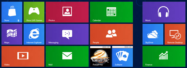
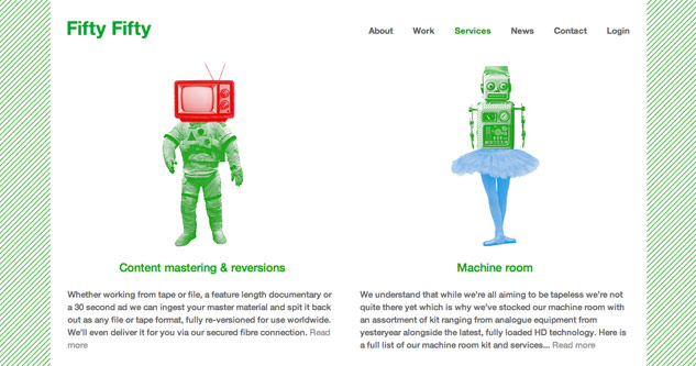
If the latest iPhone operating system from Apple is anything to go by, then less certainly is more. The design we had all become used to, whether we liked it or not, is now stripped back with super simple ‘flat’ icons. There seems to be a prevailing trend of minimalist design, where flat block colour and simple typography seems to take precedent over the use of shadows, textures and gradients, which until now were used to create pseudo 3d effects. A good example of this ‘flat’ simplicity is the Windows 8 operating system, which truly embraces the trend.
One Page Websites

We’re pretty confident one page websites will continue to be popular in 2014.
A one-page site, done well, allows users to scroll through your content quickly, removing the need to navigate to other pages. The very nature of a ‘one page’ site forces you to rethink the structure and content you wish to present. Many companies often suffer as a result of over crowded and cluttered websites.
App-like sites
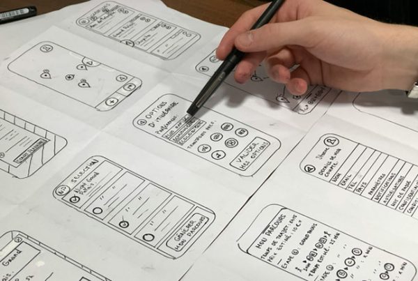
This ties in with the points mentioned above. Key to all of these trends is the speed and ease at which you can access information. A lot of responsive designs incorporate app like features when viewed on mobile devices. This generally manifests itself in the form of buttons and icons that lead you quickly from item to item (again, we can use Windows 8 as an example, where the app like design is carried across Windows mobile and PC).
Web design changes but the goal stays the same. You have a matter of seconds to catch audience attention, so make sure your website is accessible, intuitive and relative to your market.


