Services
Web design
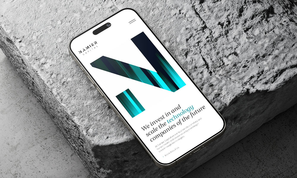
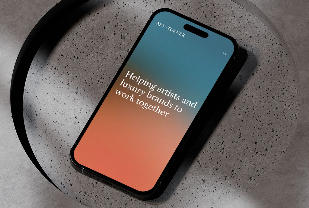
Whether you are launching a new website or tweaking your existing site, our London web designers transform your vision to create impactful digital solutions. A contemporary digital presence can be a clear differentiator and create a memorable first impression.
Web development
We work with our clients to create websites that are user-friendly, achieve results and generate a return on investment. Our knowledge and expertise helps us to balance aesthetic appeal with functional design.
Brand identity
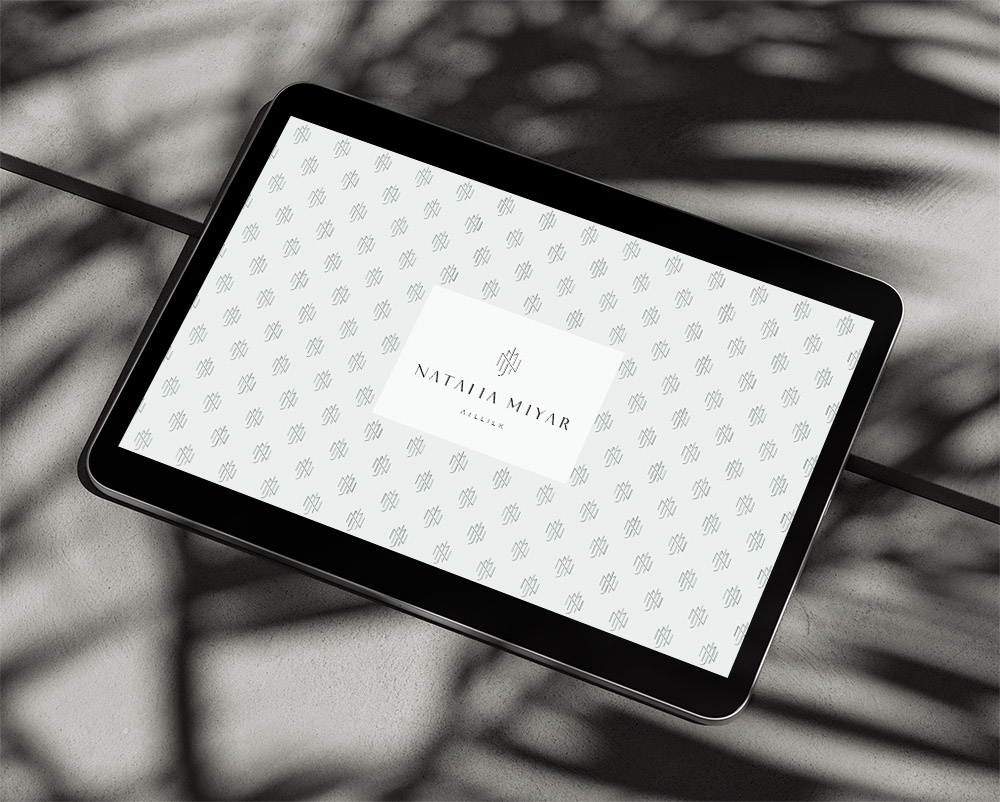
We help elevate businesses with a brand identity design tailored to their target market. A well-defined and consistent brand conveys professionalism, reliability, and expertise.
Digital marketing
Alongside our brand identity, London web design and web development offering, we will design and execute engaging campaigns to ensure your business gets the attention it deserves.
Hosting & support
We’re proud of the websites we design and therefore it’s equally important for us to preserve continuity of service. We routinely host our clients’ websites and provide routine maintenance to ensure your business is online 24/7.
Pitch deck design
Alongside our key services of web design and brand identity design, we also offer assistance with the design of pitch decks, financial reports, monthly newsletters, PowerPoint templates and business stationery.
Key sectors
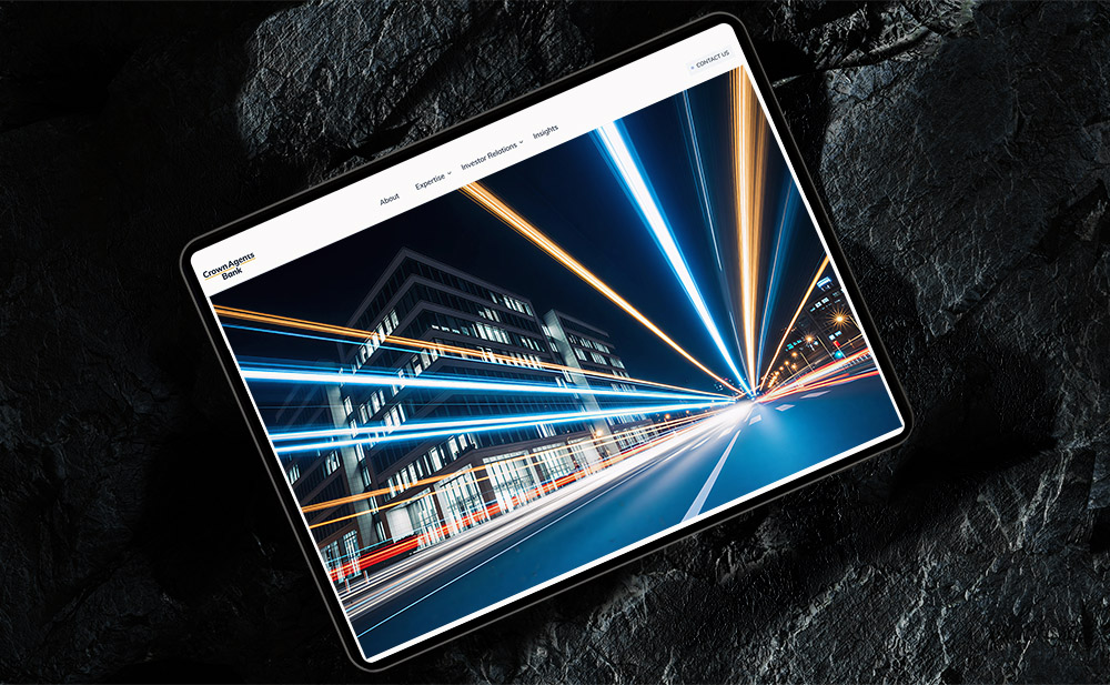
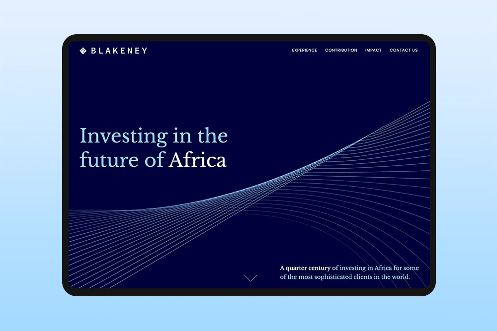
We understand the web design requirements of London financial companies that need to demonstrate professionalism and credibility with their discerning clients. Our experienced team has worked with private equity, hedge funds, venture capital, and other investment firms.
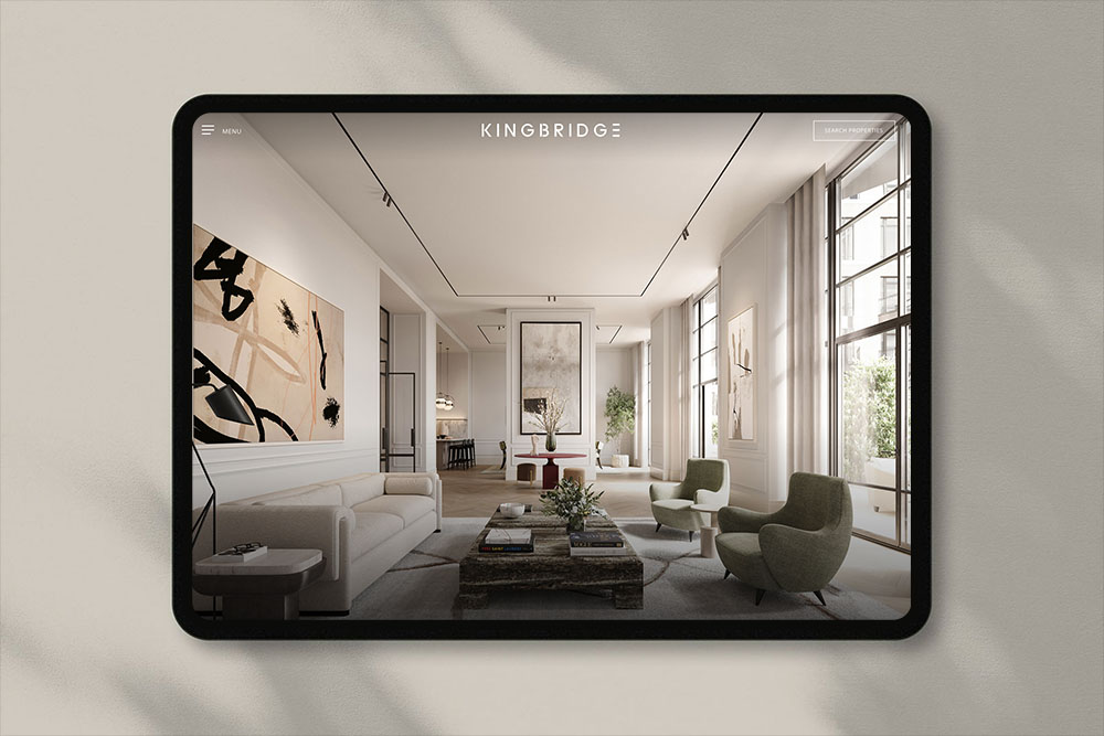
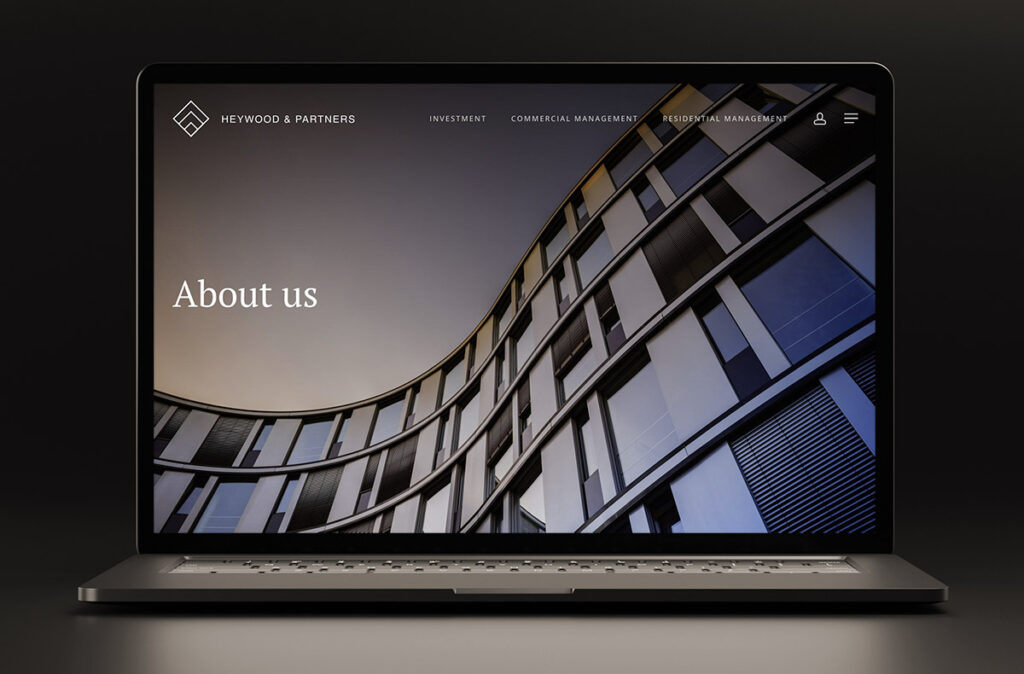
We offer industry-specific London web design solutions tailored to meet property business needs. We work with architects, interior designers, agents and property investors.
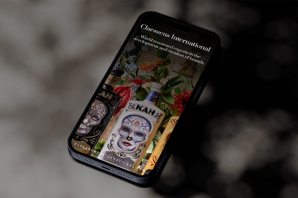
We understand the design requirements of the B2B sector in demonstrating professionalism and credibility when presenting products or services to a discerning client base.
We design web sites for top London PR, digital and market research companies. Our London web design & graphic designers can give you the edge over your competition.
